Nodes and layout
An app's screen is a tree of nodes. This page lists the nodes, then how rows, columns, grids and layers size and place them, how a layout follows state and the terminal's size, and how a widget lays out parts of its own. Borders and titles are on Panels, themes and stylesheets; the nodes that hold data (lists, tables, trees) have pages of their own, listed on the overview.
Nodes
| Builder | What it shows |
|---|---|
text!("…{signal}…") |
Console markup with format! arguments; signals format as their value and are read reactively |
text(move \|\| …) |
Markup from any closure; every signal it reads is tracked |
label("…") |
Markup that never changes |
renderable(move \|\| table) |
Any rich renderable, rebuilt when the signals it read change |
column([...]), row([...]) |
Children laid out down or across |
grid([sizes], [...]) |
Children in rows and columns (see Grids) |
each(move \|\| keys, \|key\| node) |
One child per key, kept by key across reorders |
switch(move \|\| key, \|key\| node) |
One child at a time, chosen by key; the others are kept (tabs, wizard steps) |
list(move \|\| rows, selected) |
A scrolling list with a selected row (selected is a Signal<usize>); ↑↓ jk, Home/End and PageUp/PageDown move it, a click selects a row and the wheel moves it |
log.view() |
A streaming Log |
component(Input::new("Name"), on_done) |
A rich-interact component (see Components) |
repeating(\|\| Input::new("Add"), on_done) |
The same, built fresh after each answer (an entry box) |
layers([...]) |
Children stacked on one rectangle, later ones on top (see Layers) |
effect(node, \|canvas, cx\| …) |
A node, with a closure drawing over what it drew (see Effects) |
fill("·", "bright_black") |
Its area filled with a glyph: ratatui's Fill |
.panel("Title") wraps a node in a rounded border that is highlighted
while the focus is inside it (see Panels for titles, kinds of
border, sides and shadows), and .padding(1, 2) leaves space round it
(rows above and below, columns either side).
Text alignment, wrapping and overflow
A text, label or text! node wraps its lines at its width. Three
builders change that, as ratatui's Paragraph options do:
label("The quick brown\nfox jumps over\nthe lazy dog")
    .text_align(TextAlign::Center)     // Left (the default), Center, Right or Justify
    .panel("Centred")
label("a line too long for its node")
    .no_wrap()                         // cut at the edge, not wrapped
    .overflow(Overflow::Ellipsis)      // with `…`; Fold (the default) or Crop
╭─ Centred ──────────╮
│  The quick brown   │
│   fox jumps over   │
│    the lazy dog    │
╰────────────────────╯
Alignment does not change a text's natural width: an .auto() node is
as wide as its longest line. A stylesheet sets the same with
text-align, text-wrap: nowrap and text-overflow: ellipsis (or clip,
or fold).
.truncate_start() cuts a line too long from its start instead, with
… where it was cut, and does not wrap: a path keeps where you are
(…/rich/src), as Yazi's header does. rich's Overflow is a mirror of
upstream's and cuts only at the end, so this is the node's own option.
For a trail of parts with each styled, see breadcrumb
(a path's is files::path_crumb). .truncate_middle() keeps both
ends instead (long_na…me.txt): names in tiles, a delete prompt.
fit_text(|| vec![long, medium, short]) shows the longest of several
forms that fits its width, read again as signals change, the last cut
with … when none fits; an .auto() one is as wide as the form it shows:
fit_text(move || vec![
    format!("SELECTED: {name} ({size}, {files} files)"),
    format!("SELECTED: {name} ({size})"),
    format!("{name}"),
])
Layout
A child's size along its parent's axis:
.fixed(3): exactly 3 cells;.percent(40): 40% of the parent;.ratio(1, 3): a third of the parent, ratatui'sConstraint::Ratio. Each is rounded down, and the cells that leaves go to the last ratio, so three thirds fill the parent exactly;.auto(): as big as its content (the lines a text wraps to, a panel's content and border, a list's rows). When a signal the content reads changes, the parent lays out again, and the nodes after it move;.flex(2): a weighted share of what is left. A node with no size isflex(1).
Any of them can be clamped with .min_size(n) and .max_size(n). A
flexible child that reaches a clamp keeps it, and the others share the rest,
as CSS flexbox does. When the children ask for more than there is, they
shrink from the last one, to their minimums first.
column([
    text!("{status}").auto(),                    // as tall as the status
    row([
        sidebar.percent(25).min_size(20),
        main.flex(1),
    ]),
    label("[muted]q quits").fixed(1),
])
.gap(1)
.gap(1) leaves a row (or, in a row, a column) between neighbours.
Alignment and wrapping
Rows and columns place their children as CSS flexbox does, with CSS's names:
- Across the axis,
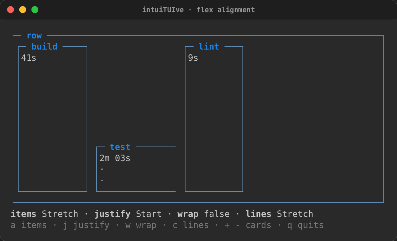
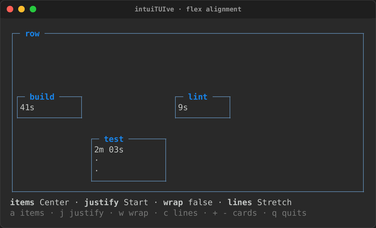
.align_items(Align::Center)sizes each child to its content (its width in a column, its height in a row) and places it atStart,CenterorEnd.Stretch, the default, gives every child the whole width or height. A child's own.align_self(..)wins. - Along the axis,
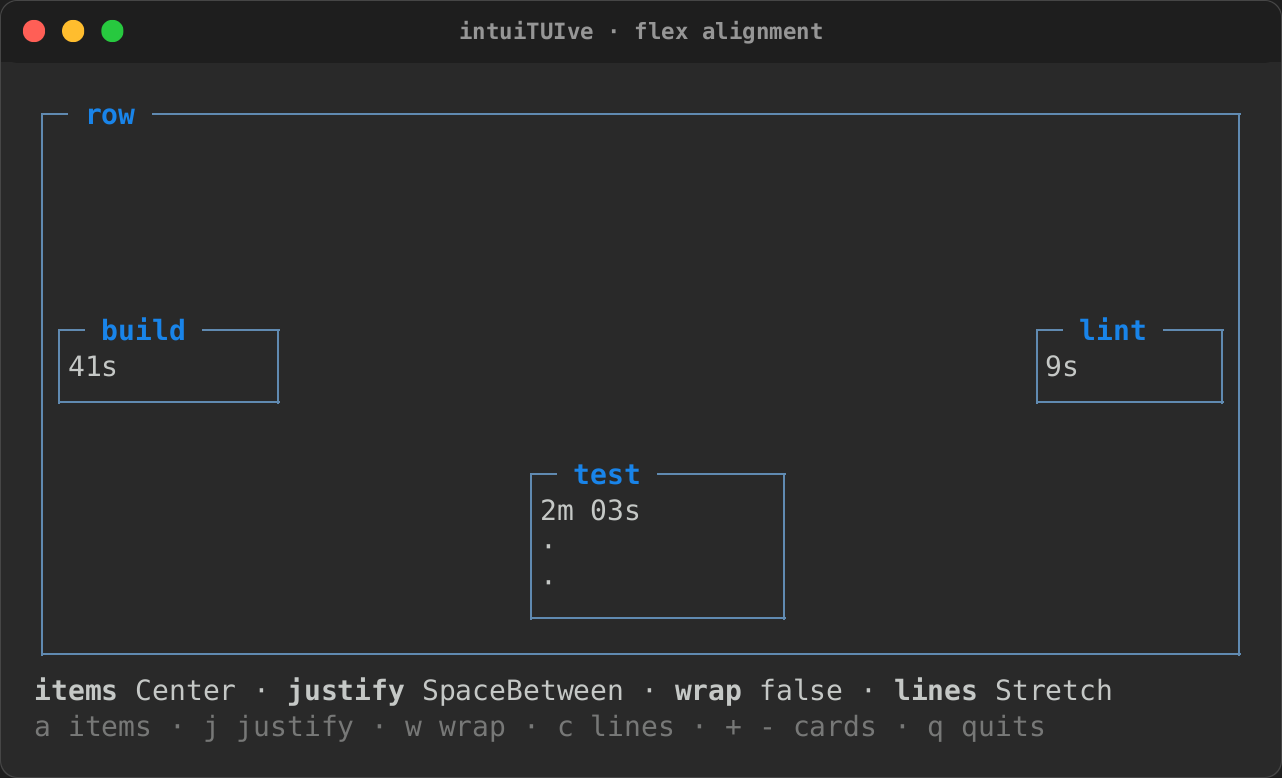
.justify(Justify::SpaceBetween)shares out the room the children leave:Start(the default),Center,End,SpaceBetween,SpaceAroundorSpaceEvenly. A flexible child takes the room itself, so a container with one has nothing left to justify. Docked children keep to their edges, and the others are justified between them. .wrap()moves children that do not fit to a new line (a new column, in a column),gapapart. Each child starts at its own size (a flexible one at its content's, within its clamps), each line is laid out on its own, and.align_content(..)places the lines:Stretch(the default) grows them to share the room. A wrapping row with.auto()is as tall as its lines.
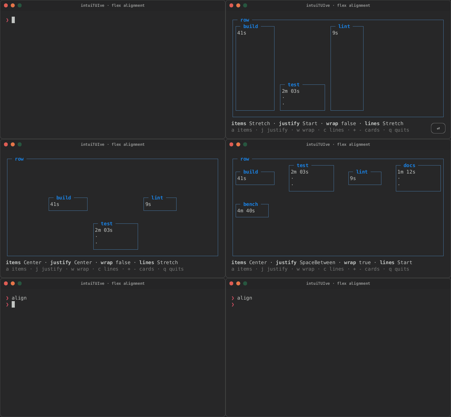
The align example cycles through them with keys
(cargo run -p rs-rich-intuituive --example align):
let board = move || {
    let mut cards = row(cards(count.get()))
        .gap(1)
        .align_items(ALIGNS[align.get()])
        .justify(JUSTIFIES[justify.get()]);
    if wrap.get() {
        cards = cards.wrap().align_content(CONTENTS[content.get()]);
    }
    cards.panel("row")
};
Stretch, the test card align_self(End) |
align_items(Align::Center) |
|---|---|
 |
 |
justify(Justify::SpaceBetween) |
.wrap(), two more cards |
 |
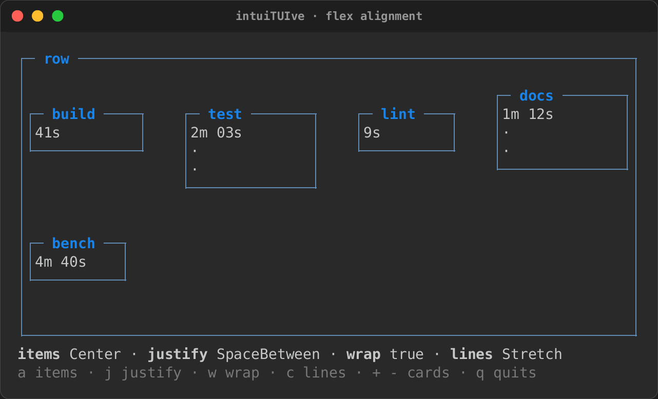 |
A stylesheet sets the same with align-items, align-self,
justify-content, flex-wrap and align-content; see
Stylesheets.
Grids
grid(
    [Size::Fixed(12), Size::Flex(1), Size::Flex(1)],
    [
        label("logo").span(1, 2),     // one column, two rows
        label("title").span(2, 1),    // two columns
        cpu.panel("CPU"),
        memory.panel("Memory"),
    ],
)
.rows([Size::Auto])
.gap(1)
- Children fill the grid row by row; each takes the first place it fits.
- Columns are the sizes given. Rows share the height evenly unless
.rows([...])sizes them, and rows past the last size given take that size, so.rows([Size::Auto])makes every row as tall as its content.
Layers
layers([...]) stacks its children on one rectangle, each later one over
the ones before: content over a background, a badge over a chart, a panel
over a board that ticks. A layer takes the whole rectangle, less
.inset(top, right, bottom, left) (CSS's inset), or, with
.place(across, down), only its content's size, where the two Aligns
put it.
layers([
    board,                                            // redraws every tick
    label("on top").panel("Badge").inset(1, 2, 1, 10),
    label("[b]3[/]").place(Align::End, Align::Start), // the top right corner
])
row 0 tick 3 -----------
row 1 tick╭─ Badge ──╮--
row 2 tick│on top    │--
row 3 tick│          │--
row 4 tick╰──────────╯--
row 5 tick 3 -----------
Layers composite: where a layer draws nothing (the room round a centred
column, a gap between its children) the ones below it show, so a backdrop
is one fill under the content. A panel covers what is inside its frame,
and a node with a background (.bg(..), .style(..)) its whole
rectangle, the gaps its children leave included (a layers node whose
children are inset); text covers the cells it writes. When any layer is to draw,
they all draw once, bottom first, none clearing what is under it, so the
board's ticks never show through the panel. A click goes to the top layer under the pointer,
and the Tab order and the accessibility tree follow the children's order
(a lower layer's text, read from the screen, leaves out what is over it).
Layout that follows state
Sizes and visibility can read signals; the parent lays out again when they change:
row([
    // gitui's 40/60 swap while the staged list has the focus.
    unstaged.size_with(move || if has_focus(staged_id) { Size::Percent(40) } else { Size::Percent(60) }),
    staged.flex(1),
    // A details pane toggled by a key keeps its state while hidden.
    details.shown_when(move || show_details.get()),
])
.size_with(|| Size)sizes a node by state, as.size(..)does once..shown_when(|| bool)(and.hidden_when) shows a node only while the condition holds: hidden, it takes no room, no clicks and no focus (a focused node inside lets it go), and keeps its state.keyed(|| key, |key| node)is one child built again whenever the key changes, the old one dropped (itson_unmounts run, its subscriptions end): a pane whose shape follows state, a table rebuilt when its column set changes. While the key stays, the child stays. When the old child had the focus, the new one's first focusable node takes it.switch(..).keep_last(n)keeps at mostnpages, dropping the one shown longest ago; a plainswitchkeeps every page it built, as tabs want.- An
.auto()switch(orkeyed) is as big as its page asks to be: the page's own.fixed(n),.min_size(n)and.max_size(n)count, as a row would lay the page out.
Treemaps
layout::squarify(rect, &weights, (min_columns, min_rows), aspect) lays
weights out as tiles in proportion, as near square as they let them be (a
cell aspect times taller than wide), covering the rectangle edge to edge;
the smallest that would make a tile below the minimum share one tile for
the rest (Squarified { tiles, rest }), made larger than their share
where that would be a strip too thin for a tile (one item of 96% beside
it). treemap(items, |key, rect| node)
is the node: a tile per (key, weight), its node kept while its key and
size stay, and treemap_with(.., TreemapOptions::new().min_tile(8, 3)
.aspect(2.0).rest(|n| node)) for the rest's tile:
treemap_with(
    move || folders.get(),                        // Vec<(String, f64)>
    |name, rect| fit_text(move || vec![name.clone(), "…".into()]).panel(""),
    TreemapOptions::new().min_tile(8, 3).rest(|n| label(format!("+{n}"))),
)
.bind_directional_focus("left h", "right l", "up k", "down j")
Laying out by hand
A widget that places its own parts (a pop-up beside a cell, a gauge's
ticks) uses the same solver as columns and rows:
intuituive::layout::split(rect, axis, &tracks, flow), ratatui's
Layout::split. Each Track is a Size with its clamps, and flow (a
StackLayout) gives the gap and the justification.
split_with_spacers returns the rooms between and around them too:
use intuituive::layout::{split_with_spacers, Track};

let tracks = [Track::new(Size::Fixed(4)), Track::new(Size::Fixed(4)).min(2)];
let flow = StackLayout { justify: Justify::Center, ..StackLayout::default() };
let (areas, spacers) = split_with_spacers(rect, Axis::Horizontal, &tracks, flow);
// spacers[0] and spacers[2] are the room left at the two ends.
Rect (intuituive::screen::Rect, rs-rich-ext's) has the helpers such a
widget needs: centered(width, height), inset(top, right, bottom, left),
inner(n), offset(dx, dy), union, intersection, intersects,
contains, and rows() and columns() to go through it a line at a time.
Ratatui's solver
A column or row takes percentages of the room its gaps leave, rounded
down. Ratatui's Layout takes them of the whole length and lets a
constraint solver squeeze what does not fit, so a header ported from a
ratatui Table (scope-tui's) puts its cells a few columns off.
.solver(Solver::Ratatui) solves a column or row as ratatui does, with the
same constraints at the same strengths and the same solver (kasuari): a
Size::Percent is ratatui's Percentage, Fixed its Length, Flex its
Fill, the gap its spacing, and .justify(..) its Flex (Start, as a
Table's columns, by default; Solver::RatatuiLegacy is Flex::Legacy,
a Layout's default). It is off by default, so no existing layout
changes, and layout::split takes it too (StackLayout::solver).
row([label("scope").percent(35), label("1ms").percent(25), label("60fps").percent(40)])
    .gap(1)
    .solver(Solver::Ratatui)
Responsive layout
A layout can follow the terminal's size. The size is the app's viewport: the columns and rows it lays out in, which are the terminal's, less the inspector's columns while it is shown (an inline app's rows are its region's). Every resize measures it again, and what depends on it lays out again.
.hide_below(60)hides a node while the viewport is narrower than 60 columns, and.show_below(60)shows one only then. Hidden, a node is as if a stylesheet saiddisplay: none, in any container: it takes no room (a hidden pane of asplitleaves the other the whole split, with no divider), it is not drawn and takes no clicks, and it and what is inside it leave the Tab order, the accessibility tree and linear mode's lines. A node that had the focus gives it to the next one..hide_below_height(rows)and.show_below_height(rows)do the same for the height.- A stylesheet's
@mediarules change sizes, grid tracks, padding, borders,displayand the rest at a size, from outside the code. viewport()returns the size as a value that nodes read like a signal, for anything else: aswitchthat picks arowor acolumn, a shorter label.
column([
    label("[b]ops[/] · 3 hosts").fixed(1),
    row([
        hosts.panel("Hosts").fixed(12).hide_below(60),
        grid([], [cpu.panel("CPU"), memory.panel("Memory")]).name("meters"),
    ]),
    label("[dim]wider for hosts").show_below(60).fixed(1),
])
At 64 columns, then at 40 (the snapshots of tests/responsive.rs, which
resizes it between the two):
ops · 3 hosts
╭─ Hosts ──╮╭─ CPU ──────────────────╮╭─ Memory ───────────────╮
│web-1     ││42%                     ││1.2 GB                  │
│web-2     ││                        ││                        │
│db-1      ││                        ││                        │
│          ││                        ││                        │
│          ││                        ││                        │
╰──────────╯╰────────────────────────╯╰────────────────────────╯
ops · 3 hosts
╭─ CPU ────────────────────────────────╮
│42%                                   │
╰──────────────────────────────────────╯
╭─ Memory ─────────────────────────────╮
│1.2 GB                                │
│                                      │
╰──────────────────────────────────────╯
wider for hosts
hide_below(60) and @media (max-width: 59) are the same breakpoint:
CSS's bounds are inclusive.
Below some size an app cannot be used at all. App::min_size(64, 28,
"Terminal must be at least 64 x 28!") shows the message centred instead
of the app while the terminal is smaller, holding every key but q (and
Ctrl+C), and the app comes back as it was once there is room:
The message can be a node of its own, or shorter on a narrow window.
App::min_size_with(w, h, || node) shows what the closure builds, centred
at its own size (a box in the app's colours, a tip under the message);
it is built the first time the terminal is too small, and kept.
App::min_size_forms(w, h, [long, shorter, shortest]) shows the longest
form that fits the width, on one line, as a fit_text does: