Chrome, your own widgets and effects
The rows round an app's content (status bars, breadcrumbs, key hints, description lists), then how to write a widget of your own with the same powers as the built-in ones, and effects that rework what a node drew.
Bars for an app's chrome
Ready-made nodes cover the rows round an app's content (in
intuituive::widgets):
use intuituive::widgets::{breadcrumb, cells, key_hints, live, seg, status_bar, Caps};

column([
    breadcrumb(move || trail.get()).crumb_suffix(move || flags()),
    body.flex(1),
    status_bar(
        [
            seg(move || format!(" {} ", mode.get())).style_with(move || mode_style()),
            seg(move || format!(" {} ", size())).style("blue on white"),
            seg(move || format!(" {}", name())),
        ],
        [seg(move || format!(" {}/{} ", at(), len())).style("white on blue")],
    )
    .caps(Caps::Rounded),
    key_hints(),
])
status_bar(left, right)is one row of segments, the left group from the left edge and the right against the right one. A segment is markup on a style (seg(..).style(..), orstyle_withfor one that changes); with.caps(Caps::Powerline)orCaps::Rounded(Yazi's; both need a Nerd Font) a glyph between two segments takes the colour of the one it ends on the background of the next, as lualine and vim-airline draw them. A segment with no background gets no cap, an empty one is left out, and the left group is cut with…when the two do not fit.seg_gauge(|| fraction, || label)is a segment that is a gauge,.width(cells)wide (10 by default): the share filled in its style (status_bar.gauge, black on green), the rest instatus_bar.gauge.rest, the label centred over both: a task's progress..when(|| cond)on any segment leaves it and its caps out whilecondis false: a gauge only while tasks run.facts([("Name", value), ..])is a description list: the keys in a column as wide as the widest (at most half), in the theme'sfacts.keystyle (bold) or.key_style(..)'s, each value beside its key, wrapped under itself.facts_of(|| rows)reads signals: the details of whatever is hovered..value_style("yellow")styles the values (the theme'sfacts.value, none by default), and.value_style_for(|i| Some(style))one row's value over it. Read aloud askey: valuepairs.breadcrumb(|| parts)is a trail header over any parts (a tree's ancestors, a wizard's steps, a path's directories): the parts joined by›(.crumb_separator("/")changes it), the last in the theme'sbreadcrumb.laststyle (bold by default), the rest inbreadcrumband the separators inbreadcrumb.separator; an empty part shows nothing, so a leading one puts a separator first. Too long, it loses its start,…where it was cut..crumb_suffix(|| markup)adds markup after it that is never cut. A file path, with the home directory as~, is thefilesplugin'spath_crumb(|| path), built on it.key_hints()is a footer of the keys that work now: the described bindings of the focused node and its ancestors (a pop-up's while one is open), innermost first,key descriptioninkey_hints.keyandkey_hints.desc,·apart; what does not fit is left out whole. Bubbles'helpand Textual'sFooter, from the same.binddescriptions the help uses.key_hints_with(KeyHintsOptions)shows them other ways:.format(|key, desc| format!("{desc} [{key}]"))(drawn whole inkey_hints.hint),.key_symbols(true)(⏎ ⇥ ↑ ^u) or.key_format(KeyFormat::Vim),.show_disabled(true)greying thebind_whenbindings that cannot run now (key_hints.disabled) instead of leaving them out,.separator(" "), and.more(expanded, "more [.]"): the label in place of what does not fit, and every hint on as many rows as it takes whileexpandedholds (gitui's command bar).hex_view(|| bytes, top)is rs-rich-ext'sHexViewas a scrolling node: any bytes ashexdump -Clays them out.cells([(35, a), (25, b), ..])is ratatui's one-rowTable: a row of nodes sized by percentages withSolver::Ratatuiand a cell between (.gap(n)changes it), text cut at each cell's edge with no….live(fps_cap, || renderable)draws a renderable at mostfps_captimes a second of the app's clock: a plot fed by a fast source draws at the cap and drops the changes between, the next draw showing the newest, and a change within the cap waits its turn, so the last one is shown.
Small widgets after Textual's
use intuituive::{header, key_panel, link, masked_input, placeholder, progress_bar};

header().clock()                                  // the app's title, the screen's subtitle
link("Docs", "https://example.com")               // Enter or a click opens it
progress_bar(done, total).show_percentage(true).show_eta(true)
masked_input(date, "9999-99-99")                  // 20261027 shows 2026-10-27
key_panel()                                       // the keys that work now, one a row
placeholder("sidebar")                            // a coloured block for a prototype
header()showsApp::title(..)and the top screen'scx.set_subtitle(..), centred, in the theme'sheaderstyle..clock()adds the time (UTC, moving with the app's clock),.tall()makes it three rows; a click toggles tall.link(text, url)can take the focus; Enter or a click opens the URL with the system's opener ($OPENER,xdg-open,open), or runs.on_activate(|cx| ..)instead..open_with(|url| ..)opens it another way, as a test's stub does. It is an OSC 8 hyperlink too.progress_bar(done, total)drawsdoneoftotal(signals off64andOption<f64>); with no total it pulses on the app's clock. The ETA counts from its first frame, at the rate so far.masked_input(value, template)keeps to a template as Textual'sMaskedInputdoes:9/0a digit (required, optional),A/aa letter,N/na letter or digit,X/xanything,>/<upper or lower case,;_the blank. Separators are fixed, the caret and Backspace skip them, and the node is:invalidwhile partly filled.key_panel()lists the focused path's bindings askey description, greying those that do not apply;cx.toggle_key_panel()hides and shows it.placeholder(label)fills its area with the next of twelve colours and its label;.placeholder_variant(PlaceholderVariant::Size)shows its size,Texta paragraph, and a click cycles them.
Your own widgets
Anything the built-in nodes do, a widget of yours can do too. It
implements Widget, and widget(w) makes a node of it, which takes every
builder (.flex, .panel, .on_key, .name):
use intuituive::widget::{widget, Canvas, DrawCx, EventCx, MouseExt, Used, Widget, WidgetEvent};

/// A counter that a click or `+` counts up.
struct Counter(u32);

impl Widget for Counter {
    fn name(&self) -> &'static str {
        "counter"
    }

    fn draw(&mut self, cx: &mut DrawCx, canvas: &mut Canvas) {
        let style = cx.style("accent", "bold");
        canvas.print(0, 0, &format!("count {}", self.0), Some(&style));
    }

    fn event(&mut self, cx: &mut EventCx, event: &WidgetEvent) -> Used {
        match event {
            WidgetEvent::Key(key) if *key == Key::char('+') => {}
            WidgetEvent::Mouse(mouse) if mouse.is_press() => {}
            _ => return Used::No,
        }
        self.0 += 1;
        cx.redraw();
        Used::Yes
    }

    fn focusable(&self) -> bool {
        true
    }
}
What a widget can do:
drawwrites cells on aCanvas, the widget's rectangle in its own coordinates. It writes withprint,set,set_cell,fill,fill_with(a glyph),clear,lines(rendered rich segments) andrender(any rich renderable). It can also write one row of markup withmarkup, draw a rounded edge withborder, lay a style over cells withrestyle, and move everything up withscroll_up.cell(x, y)reads what is there now (itssymbol()andstyle()). Signals read here make it draw again.draw_overdraws after its children, over what they drew, in every frame where the widget or a node inside it drew: a badge, a highlight, an effect. Its canvas is not cleared, and what it writes is sent. When only a child drew, the rest of the canvas still holds whatdraw_overwrote before, so an overlay should come out the same when it runs twice (restyling cells does), or the widget should not beretained.eventgets these events:- keys while the focus is on it or inside it (with nothing focused,
while the pointer is over it), and
KeyUpwhen one is let go (from a terminal with the kitty keyboard protocol, for keys other than plain text, Enter, Tab and Backspace unless the app asks for every key); - mouse events over it, and pasted text;
Focus,HoverandResizewhen the focus or the pointer comes or goes, or its size: after the frame it is first laid out in, and whenever its size changes (a widget drawing that first frame reads its size from the canvas);Preview: keys on their way to the focused node inside it, first, when itspreviews_keysis true (a container's shortcuts that win over its children's).
Keys, releases, the mouse and paste it does not use bubble on. cx.redraw()
draws it again after a change to its own state, and cx.app() can
quit, open a screen or move the focus.
- Hover and the pointer:
- cx.hovered() in draw redraws the widget only when the pointer
enters or leaves it.
- cx.pointer() gives the pointer's cell inside it, for hover effects
on a part.
- cx.report_movement() turns on movement events without redrawing on
them.
- Where it is: cx.rect() in draw is its rectangle on the screen
(in a viewport's content, inside one), as EventCx::rect is in
event: for what is drawn outside the cells, a terminal graphic over
the widget.
- A picture a cell at a time: canvas.put_rgb(x, y, '▀', Some(fg),
Some(bg)) sets one cell with plain RGB colours, building no segment
and no style (the pixel nodes draw with it): a full screen of half
blocks whose every colour changes each frame costs about 8 ms at
160x50 in a release build, painting included (tests/pixel_frames.rs).
Styles no cell uses any more are dropped between frames, so such a
screen keeps only a frame's worth of them.
- measure says how big it wants to be, for Size::Auto and for
modals sized to their content. MeasureCx::measure, extent and
stack measure and lay out children as the built-in nodes do.
- children and layout make it a container. Its children are
ordinary nodes, drawn after it, so it can draw chrome round them (a
header, a scrollbar). layout runs each time the widget draws, before
draw, and the signals it reads lay it out again.
- retained keeps what it drew. When only its own state changed, the
canvas is not cleared, only the cells it writes are sent, and its
children redraw only where it drew over them. cx.repaint() says when
it must draw everything. A border that changes colour on focus, or a
log that scrolls, costs a few cells.
- viewport and scroll show its children through a window. They
are laid out at their full size, drawn offscreen with their own damage,
and copied out where the widget looks. Clicks and the caret are
translated through it.
- overlapping lets its children overlap, later ones on top, as
layers does: when any of them is to draw, they all
draw once, bottom first, none clearing what is under it, so the ones
below show where a later one draws nothing; a click goes to the later
one.
- caret places the text caret while it has the focus.
- access_text says what it shows to assistive technology (Level
42% for a meter of block glyphs): the widget is read as text with that
name, after a .label code gave it, in the accessibility tree, linear
mode and to a screen reader, with no described child to wrap.
- cx.now() in draw is the app's clock, the time its loop (or a
test's update and advance) gave it: a peak that holds for a second,
a stall seen after five, tested frame by frame.
Every built-in node is a widget built on this trait: text, labels,
renderables, columns, rows, grids, panels, padding, each, switch,
logs, hosted components and scroll, as well as table, tabs, tree,
the split panes, the calendar and the menus. leaf is still the shortest
way to a node that only draws, and component hosts rs-rich-interact
components, which also run outside an app.
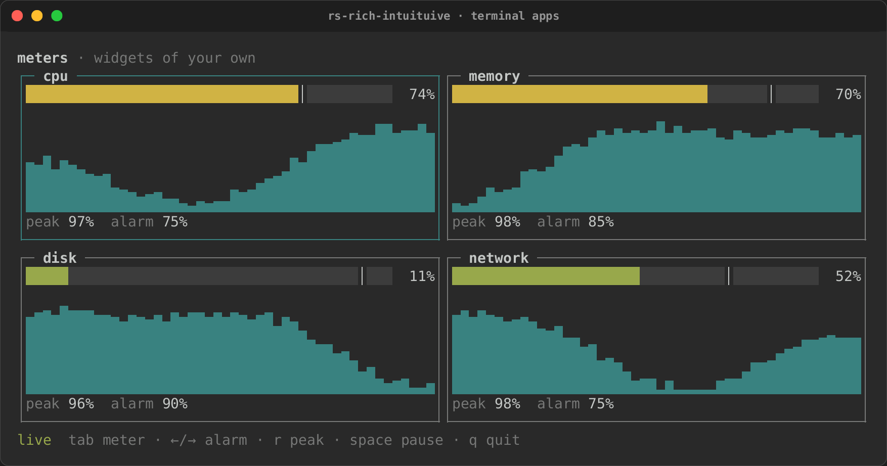
The meters example is a whole board of widgets of their own
(cargo run -p rs-rich-intuituive --example meters). Each meter keeps
what it drew and redraws only its inside rows on a new sample; it redraws
its border on Focus, sizes its sparkline on Resize, reads the sample
under the pointer, and eases its gauge with an animation. The board that
holds them sees keys first (previews_keys), and while it is paused it
keeps them from the meters.
Effects
effect(node, |canvas, cx| …) runs a closure over what a node drew, with
no widget to write: ratatui's post-processing of frame.buffer_mut(). The
closure reads cells with canvas.cell(x, y) and writes them back. It runs
whenever the node or anything inside it drew, always over what the node
drew afresh, so an effect that moves cells comes out the same each time.
The signals it reads draw it again, so a timer or an animation drives it:
let phase = signal(0u16);
every(Duration::from_millis(16), move |_| phase.update(|p| *p += 1));
effect(app_body, move |canvas, _cx| {
    // Each column drips a little further down every frame.
    let phase = phase.get();
    for x in 0..canvas.width() {
        let drop = (phase * (x % 3 + 1) / 2).min(canvas.height());
        let column: Vec<_> = (0..canvas.height())
            .map(|y| canvas.cell(x, y).map(|c| (c.symbol().to_string(), c.style().cloned())))
            .collect();
        for y in 0..canvas.height() {
            let (symbol, style) = match y.checked_sub(drop) {
                Some(from) => column[from as usize].clone().unwrap_or_default(),
                None => (" ".to_string(), None),
            };
            canvas.set_cell(x, y, &symbol, style.as_ref());
        }
    }
})
Three frames in (tests/effects.rs):
Effect presets
intuituive::fx has the effects most apps want, ready made, each timed
and eased on the app's clock (so a test steps it exactly), and each an
effect underneath. Play one over any node:
use intuituive::fx;

// Once, when the node first draws.
fx::play(welcome, fx::fade_in(Duration::from_millis(400)))
| Preset | What it does |
|---|---|
fade_in(d) / fade_out(d) |
Each cell's colours from (to) the background colour; faded out, the cells are blank |
dissolve(d) / coalesce(d) |
The cells go (come) one by one, in a scattered order |
sweep(direction, d) |
The cells show as a soft edge moving toward direction passes them |
slide_in(direction, d) |
The node slides in toward direction, coming to rest where it belongs |
hsl_shift(hue, saturation, lightness, d) |
The colours turn round the wheel, and lighten or darken |
glitch(d) |
Noise glyphs and rows jumping sideways, worst half way, gone at the end |
rain() |
Digital rain falling over the node, for ever |
shimmer(period) |
A band of light crossing text on the slant, for ever |
skeleton(period) |
What the node shows as bars pulsing dim to bright, for ever: a view whose data is loading |
placeholder(widths) |
A node: skeleton bars of the widths given, read as "Loading" |
An Fx composes. fx::sequence([..]) runs effects one after another
(the last holds its end), fx::parallel([..]) at once, fx::wait(d) is a
pause; on an effect, .delay(d) holds its start first (a fade in delayed
stays hidden), .hold(d) its end after, .repeat(n), .forever(),
.ping_pong(), .reversed(), .limit(d) and .easing(Easing::…)
(a preset's own easing, or a whole sequence's timeline):
let ms = Duration::from_millis;
// In, held, out, held, again and again.
let cycle = fx::sequence([
    fx::coalesce(ms(900)).hold(ms(900)),
    fx::dissolve(ms(900)).hold(ms(400)),
])
.forever();
How it is played decides when:
fx::play(node, fx)runs once, from when the node first draws (a page of aswitchbuilt later plays when it shows).fx::play_when(node, fx, || cond)runs from its start each time the condition turns true: a flash when a value changes, a glitch on an error.fx::play_while(node, fx, || cond)runs while it holds, the node as it is otherwise:play_while(table, fx::skeleton(period), move || loading.get()).fx::transition(node, fx, || shown)plays forwards as the node shows and backwards as it goes, and hides it (shown_when) once back at the start; a change half way turns round from where it is.
A running effect asks for a frame every fx::FRAME (16 ms); once it is
over it asks for none, and its last state stays, so a finished fade costs
nothing. In accessible and linear mode there is no motion: an effect is
drawn at its end at once (an endless one at its start, where a skeleton
is still bars and rain has not begun), as cx.animate does.
The colours come from the theme: the fx style's background is the
colour cells fade to (black unless set) and its colour the one assumed for
text that has none; fx.shimmer, fx.rain and fx.skeleton (its colour
the dim end of the pulse, its background the bright end) colour those
presets:
Fx::new(length, |frame, canvas, cx| …) makes your own: it gets the
canvas as effect does, and a Frame with its eased progress (0 to 1)
and elapsed time; Fx::endless one that never ends. It composes and
plays like the presets.
Coalesce and dissolve, frame by frame (tests/fx.rs):
@ 0 ms
dissolve and
coalesce cel


@ 96 ms
dissol e a d
 oalesce  el
      v   n
c        c
@ 192 ms
d sso    a
    esce
 i   lve  nd
coal     cel
@ 288 ms
  s o    a
    e
di s lve  nd
coal sce cel
@ 384 ms


dissolve and
coalesce cel
A splash screen
fx::splash(cover, hold, app) fades the cover in, keeps it for hold,
fades it out, and fades the app in in its place; Enter or Esc skips it.
The cover is any node, so with the art feature it is an image:
App::new(|| {
    let logo = image("logo.png").fixed(12);
    fx::splash(logo, Duration::from_secs(1), main_view())
})
examples/fx.rs is a gallery of every preset, after a splash:
cargo run -p rs-rich-intuituive --example fx.