Panels, themes and stylesheets
How nodes look: panels (boxes, titles, rules and shared borders), themes (the named styles the framework and your markup use), a style on a node, and stylesheets, which style and lay out an app from a file that reloads while it runs.
Panels
.panel(title) wraps a node in a box: rounded, its title at the top left,
lit in the theme's border.focused while the focus is inside. Titles are
console markup. Builders after .panel change the rest, as ratatui's
Block options do (on any other node they do nothing):
label("3 open, 1 merged")
    .panel("[b]Pull requests[/]")
    .title_align(Align::Center)                    // where .panel's title sits
    .title_right("[dim]loading…")                  // another title on the top edge
    .title_bottom("[dim]q quits")                  // a title on the bottom edge
    .add_title(Edge::Bottom, Align::End, "1/20")   // the general form
    .border(Border::Thick)                         // or Plain, Double, Ascii, the dashed kinds, None…
    .borders(Sides::TOP | Sides::BOTTOM)           // Sides::ALL is the default
    .border_style("bright_black")                  // while the focus is elsewhere
    .title_style("bold white")
    .shadow(Shadow::MediumShade)                   // or LightShade, DarkShade, Block, Dim, Symbol('$')
- Titles keep the look of
.panel's:Title, one glyph of line in from the corner. Several with the same alignment sit side by side, one cell apart. When they do not fit, the right-hand ones give way first, then the centred ones, and the left ones are cut with…. An edge with a title keeps its row even when its line is not drawn, so.border(Border::None)gives a heading above the content, as ratatui'sBlock::new().title(..)does. The first top title, as plain text, is the panel's accessible name. - Sides. The inside grows into the sides that are not drawn.
- Shadows take a strip on the right and the bottom of the panel's own
rectangle, in the theme's
shadowstyle; the box is a cell narrower and shorter for it.
Titles at the left, the centre and the right, and two at the bottom:
╭─ Left ─────────────────────╮
│left                        │
╰────────────────────────────╯
╭────────── Centre ──────────╮
│centre                      │
╰────────────────────────────╯
╭──────────────────── Right ─╮
│right                       │
╰────────────────────────────╯
╭────────────────────────────╮
│two titles at the bottom    │
╰─ q quits ─────────── 1/20 ─╯
Each kind of border, Border::Custom(BorderSet { .. }) (glyphs of your
own) last, then three shadows:
╭──╮┌──┐┏━━┓╔══╗+--+┌╌╌┐┏╍╍┓
│  ││  │┃  ┃║  ║|  |╎  ╎╏  ╏
╰──╯└──┘┗━━┛╚══╝+--+└╌╌┘┗╍╍┛
┌┄┄┐┏┅┅┓┌┈┈┐┏┉┉┓▗▄▄▖▛▀▀▜┌~~┐
┆  ┆┇  ┇┊  ┊┋  ┋▐  ▌▌  ▐│  │
└┄┄┘┗┅┅┛└┈┈┘┗┉┉┛▝▀▀▘▙▄▄▟└~~┘
╭─ A ────╮ ╭─ B ────╮ ╭─ C ────╮
│medium  │▒│block   │█│own     │$
╰────────╯▒╰────────╯█╰────────╯$
 ▒▒▒▒▒▒▒▒▒▒ ██████████ $$$$$$$$$$
A stylesheet sets the same: border: thick (and every kind by name),
border-title, border-title-align, border-subtitle (the bottom
title), border-subtitle-align and border-sides: top bottom. Code wins
over the sheet.
Titles and borders that follow state
.panel_with(|| markup) makes a panel whose title is read again as the
signals it reads change (Diff: src/lib.rs, Processes (3 of 210));
.title_with(|| ..) does the same on a panel already made, and
.add_title_with(edge, align, || ..) adds one beside add_title's. The
kind of box can follow state too: .focus_border(Border::Double) while
the focus is inside (Slumber's selected pane), .border_with(|| ..) from
anything else.
list(rows, cursor)
    .panel_with(move || format!("Commit {}/{}", cursor.get() + 1, count.get()))
    .border(Border::Plain)
    .focus_border(Border::Double)
Titles at the corner, and plain-text titles
A panel puts its titles a glyph in from the corner, with a space either
side: ╭─ Files ─. A ratatui Block puts its title right at the corner,
with no spaces added. .title_flush() draws a panel's titles that way,
for an app ported from ratatui, or one that looks like one:
list(files, cursor)
    .panel("Staged Changes")
    .border(Border::Plain)
    .title_flush()                                   // ┌Staged Changes─────┐
    .add_title_with(Edge::Bottom, Align::End, branch) // ───────────{main}┘
Every title of the panel is flush: a right-hand one sits against the right
corner, and a centred one is centred on the whole edge. Put spaces in a
title to keep them: .panel(" Library ").title_flush() is termusic's
╭ Library ─.
Titles are console markup, so a title with brackets in it (Recipe [r])
loses them as a tag. .panel_text(title), .panel_text_with(|| ..) and
.add_title_text(edge, align, text) take plain text and show it as it is.
Rules, and a border on any node
rule() is a line across, one row tall, in the theme's border style.
Directly inside a panel, from its left side to its right, it joins the
border, in the panel's kind and focus colour: the ├──┤ between the parts
of a help box. Padding between them does not keep it apart: a rule at the
inside edge of a padded column (.padding(0, 1)), or of a panel a
stylesheet pads, runs across the padding to the border, so the column is
padded once rather than each part. .border(Border::Thick)
picks the kind of a rule on its own, and it is left out of what assistive
technology reads.
.borders(Sides::BOTTOM) (or any sides) on a node that is not a panel
puts it in a panel without a title first: an underlined header, a status
line with a rule above it.
Collapsed borders
.collapse_borders() on a row, column or grid of panels draws one
frame for them all: neighbours share their edges, joined where lines meet.
Each panel's titles sit on its own edges and its content between the
lines. The lines round the panel with the focus are lit in
border.focused, and .focus_border(Border::Thick) draws them thick, as
ratatui's collapsed-borders example does for the selected pane:
column([
    pane("Top"),
    row([pane("Left"), pane("Right")]).collapse_borders(),
    pane("Bottom"),
])
.collapse_borders()
.border(Border::Plain)
.focus_border(Border::Thick)
┌─ Top ────────────────┐
│Top                   │
┢━ Left ━━━┱─ Right ───┤
┃Left      ┃Right      │
┡━ Bottom ━┹───────────┤
│Bottom                │
│                      │
│                      │
└──────────────────────┘
A collapsed container inside another shares its lines and takes its look;
a grid whose top and bottom panes .span(2, 1) draws the same.
.border(..) and .border_style(..) on the container set its lines, gaps
are ignored, and a hidden child gives its room to the others. In a
stylesheet: border-collapse: collapse, with the container's border for
its lines.
Themes
A Theme styles what the framework draws (borders, the focused border,
panel titles) and names styles for markup. The presets, Theme::dark() (the
default), Theme::light() and Theme::mono(), each define accent,
muted, good, warn and bad:
Add your own with Theme::dark().style("brand", Style::parse("bold magenta")?),
set it with App::theme, and switch at run time with cx.set_theme(theme);
everything is drawn again in the new theme.
The framework's own parts look for names of their own and fall back to
these: a modal's or pop-up's panel title (the palette's, the help's, a
confirm's) is drawn in popup.title, else title; the which-key keys in
which_key.key, else accent, its separators in which_key.sep and its
descriptions in which_key.desc; notifications in notify.info,
notify.warn and notify.error, else accent, warn and bad. The
presets also name the stock buttons' faces,
button, button.primary and button.danger; the other
form controls fall back to accent,
good and muted.
Semantic palettes and built-in themes
New in 0.0.24: a theme can be generated from a Palette of semantic
colours, as Textual's themes are, and the 21 Textual themes are built in.
use intuituive::{Palette, Theme};
use rich::Color;

let palette = Palette::new(Color::parse("#0178D4")?)
    .secondary(Color::parse("#004578")?)
    .accent(Color::parse("#ffa62b")?)
    .dark(true);
App::new(build).theme(Theme::from_palette(palette));
App::new(build).theme(Theme::named("nord").unwrap());
cx.set_theme_named("gruvbox");        // at run time; false for an unknown name
Theme::builtin()                      // [(name, Theme)], for a picker
- The roles are Textual's:
primary,secondary,accent,warning,error,success,foreground,background,surface,panelandboost, and whether it is dark. Onlyprimaryis needed; the others default as Textual's do. - The shades are generated as Textual's
ColorSystemgenerates them, by its names and to its values (checked against Textual 8.2.8 for every built-in theme):primary-lighten-1to-3,primary-darken-1to-3,primary-muted,text-primary,text,text-muted,text-disabled,foreground-muted,border,border-blurred,surface-active,scrollbar,block-cursor-background, and the same for each role. Each is a named style: a foreground, or for the grounds (background,surface,panel,boostand their shades) a background. So they work in markup ([primary-muted]…[/]) and as$namein a stylesheet (background: $surface;). A colour with an alpha is laid over the background. - The names the presets have come from the palette, so an app written
for them follows a palette theme:
accent,muted(text-muted),good,warnandbad(text-success,text-warning, boldtext-error),selected(the block cursor), the buttons' faces, and the borders (border.focusedisborder).screenis the foreground on the background:.style("screen")on the app's root paints the whole screen in the theme. - Built in:
dark,lightandmono(the presets, unchanged), thentextual-dark,textual-light,nord,gruvbox,catppuccin-mocha,dracula,tokyo-night,monokai,flexoki,catppuccin-latte,catppuccin-frappe,catppuccin-macchiato,solarized-light,solarized-dark,rose-pine,rose-pine-moon,rose-pine-dawn,atom-one-dark,atom-one-light,ansi-darkandansi-light(the last two in the terminal's own colours). The palettes are Textual's (MIT, credited in the crate'sTHIRD_PARTY.md). No text style of any of them is under 3:1 against its background in rs-rich-ext's contrast check; a few warning and success texts of the light ones are under AA's 4.5:1, as they are in Textual.
Theme files, reloaded live
The file is rich's theme format: a [styles] section of name = style
lines. border, border.focused and title restyle the framework's parts,
and every name works in markup. The app reads the file again whenever it
changes, so you can tune colours while it runs. A file that does not parse
leaves the last good styles in place, and the inspector shows
the error. Theme::load(path) and theme.with_config(text) read the same
format without watching.
A style on a node
.style("white on #101830") draws any node in a style, ratatui's
Block::style; .bg(colour) and .fg(colour) set one colour. Each takes
a theme style's name too (.style("accent"), .bg("bad")), looked up
again when the theme changes. The style goes under what the node and its
children draw, as a stylesheet's color and background do, and fills the
rest of the node's rectangle, gaps and borders included. Code wins over a
stylesheet, and markup inside wins over both:
[on blue]one           [/]
[on blue]              [/]
[yellow on blue]two[/][on blue] and more  [/]
[on blue]              [/]
[on blue]a   b         [/]
[on blue]              [/]
Only what drew is restyled: a tick that redraws one child sends its cells, not the whole fill.
Theme styles for a subtree
.theme_styles([(name, style), ..]) gives a node and everything inside it
theme styles of its own, over the app's, as CSS custom properties do. They
hold for markup ([selected]…[/]) and for the widgets inside, which look
their styles up by name: a list's selected, a table's table.header, a
tab strip's tabs.selected, a panel's border and title. It is the
per-instance answer to ratatui's highlight_style and the like, with no
style option on each widget:
A style may name another theme style (("selected", "accent")), which
follows a theme switch. The node keeps one copy of the console and theme
with its styles, made again only when the theme changes; a node without
theme styles makes none.
Stylesheets
A stylesheet styles and lays out nodes from outside the code, in a subset of CSS:
/* app.tcss */
#status { dock: bottom; size: 1; background: $accent; color: black; }
#preview { size: 3fr; padding: 0 1; border: round $accent; border-title: Preview; }
.danger:focus { background: red; text-style: bold; }
panel table:hover { text-style: underline; }
Selectors match a node's kind (label, text, table, panel,
column, row, grid: what the inspector shows), its
.name("…") as #name, its classes as .class, and its states:
:focusand:focus-within;:hover, for the node under the pointer and its ancestors;:selectedand:disabled, while.selected_when(…)or.disabled_when(…)holds;:error(or CSS's:invalid), while.error_when(…)holds (see Errors);:blur(not focused),:enabled(not disabled) and:can-focus;:first-child,:last-child,:odd,:even(counted from the first, as CSS's:nth-child(odd)is) and:empty(no children): where the node is among its parent's children, which follows rows aneachadds or moves;:darkand:light, by the theme::dark #logoholds while the theme is dark, at the top of the app too.
States, structural and theme ones among them, change colours and text styles, not layout.
Spaces separate a node from its ancestors (panel label), and > from
its parent only (#sidebar > list); * is any node. Sibling selectors
(+, ~) and !important are not supported. The more specific rule
wins, then the later one: #a > .b beats .b.
Nesting. A rule may hold rules, as in Textual and CSS: & is the rule
around it, and a nested selector without one is a descendant (or, after a
>, a child). A nested rule reads as its flattened form, after the rule
around it. Rules nest at most 32 deep, and what nesting and variables
expand a stylesheet to may be at most four times its length (or 64 KiB);
past that it does not parse, so a stylesheet always parses quickly.
.card {
    padding: 0 1;
    &:hover { background: $panel-bg; }   /* .card:hover */
    & .title { text-style: bold; }        /* .card .title */
    > .foot { size: 1; }                  /* .card > .foot */
}
Variables. $name: value; at the top level declares a variable, which
any later value may use (a variable's value may use earlier ones). A $name
not declared is a theme style's colour, as before ($accent).
.class("warn big") gives a node fixed classes, and
.class_when("danger", move || load.get() > 90) gives it a class while a
condition holds, following the signals the condition reads.
@media rules hold at some sizes of the
viewport only:
@media (max-width: 80) {
    #sidebar { display: none; }
    #main { grid-columns: 1fr; }
}
@media (min-width: 120) and (max-height: 30) { #log { size: 50%; } }
The conditions are min-width, max-width, min-height and
max-height, in cells, inclusive as in CSS, joined with and; the space
after @media may be left out, as in CSS (@media(max-width: 80)). Inside,
rules are written as anywhere else, and the more specific rule still wins,
then the later one, whether it is in a block or not. Blocks do not nest,
and other @ rules are an error.
Properties:
color, background |
a colour (red, #ff8800, grey23) or a theme style's colour ($accent) |
text-style |
bold, dim, italic, underline, reverse, strike, blink, none (every one off); a later rule's replaces an earlier one's |
border, border-title |
round, square (or plain), heavy (or thick), double, ascii, dashed and the other dashed kinds (light-triple-dashed, heavy-quadruple-dashed, …), quadrant-inside, quadrant-outside, or none (which takes a panel's own border, its titles and their cells away), then a colour; a title (markup) |
border-title-align, border-subtitle, border-subtitle-align |
left, center or right; a title on the bottom edge, and where it sits |
border-sides |
the sides drawn: top, right, bottom, left (several), all or none |
border-collapse |
collapse draws one frame for a row's, column's or grid's panels (see Collapsed borders), or separate |
text-align, text-wrap, text-overflow |
a text's left, center, right or justify; wrap or nowrap; fold, clip or ellipsis |
size, min-size, max-size |
3, 50%, 1/3, 2fr, auto, along the parent's axis |
padding |
one to four numbers, as in CSS |
margin |
one to four numbers: room kept round the node's border, which its colours do not fill |
visibility |
hidden keeps the node's room but draws nothing in it and takes it out of the Tab order (display: none gives the room up); visible |
scrollbar-color, scrollbar-background |
the thumb's colour, and the track's ground, of a node's scrollbars (a scroll, a list, a table, a log, …), as theme styles over the node: scrollbar.thumb, scrollbar |
gap, grid-columns, grid-rows |
a stack's or grid's spacing; a grid's tracks |
display |
none hides the node and what is inside, in any container (a split's pane, a scroll's or a switch's child), takes it out of the Tab order, and out of a grid's cells |
dock |
top or bottom in a column, left or right in a row: kept at that edge |
align-items, align-self |
flex-start, center, flex-end or stretch (align-self also auto): where a stack's children sit across its axis |
justify-content |
flex-start, center, flex-end, space-between, space-around or space-evenly: what a stack does with the room its children leave |
flex-wrap, align-content |
nowrap or wrap; where a wrapping stack's lines sit (the justify-content values, or stretch) |
How it applies:
- Colours inherit, as in CSS. They go under what a node draws, so a
widget's own colours and markup's
[green]stay, and they fill in the rest of the node's area, gaps included. - Code wins.
.fixed(3)beatssize: 5,.style()and.bg()beatbackground, and.focus_style()and.hover_style()go over the sheet's colours. A node whose code sets no size takes the sheet's. - What follows states. States and
class_whenchange colours and text styles. Layout is decided by a node's kind, name and fixed classes, and decided again when a resize crosses an@mediarule's bounds (then everything draws once). A resize that crosses none matches nothing again. - Borders. A
borderon a panel restyles the panel's own box. On another node it draws a box round it, inside its area, with itsborder-title,border-subtitleandborder-sides. On a container withborder-collapse: collapseit is the kind and colour of the shared lines. - Live. A sheet file is read again whenever it changes. One that does
not parse is reported in a toast with its line and column, and the last
good sheet stays.
App::stylesheet(css)takes a string.Stylesheet::parsechecks one in a test. - Cost. Rules are matched once per node and sheet, and a node's style is worked out only when it draws. An app without a sheet does none of it.
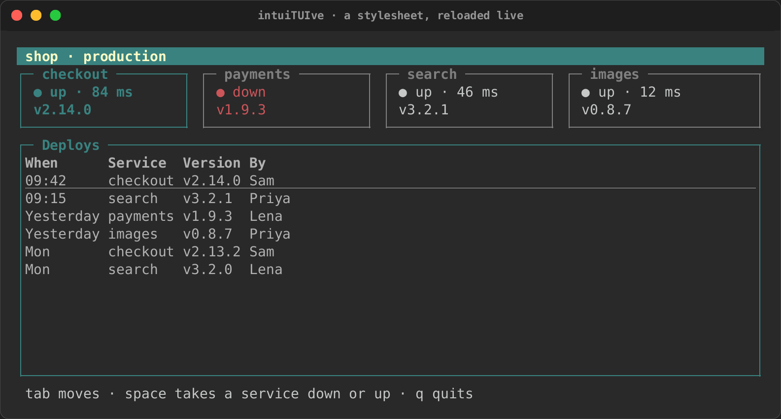
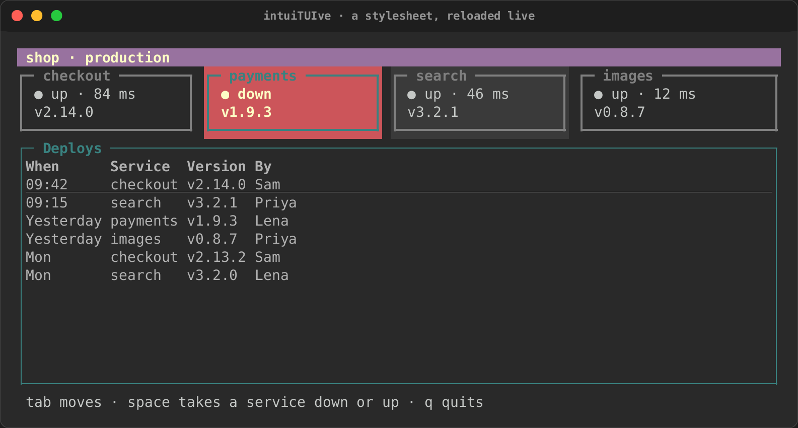
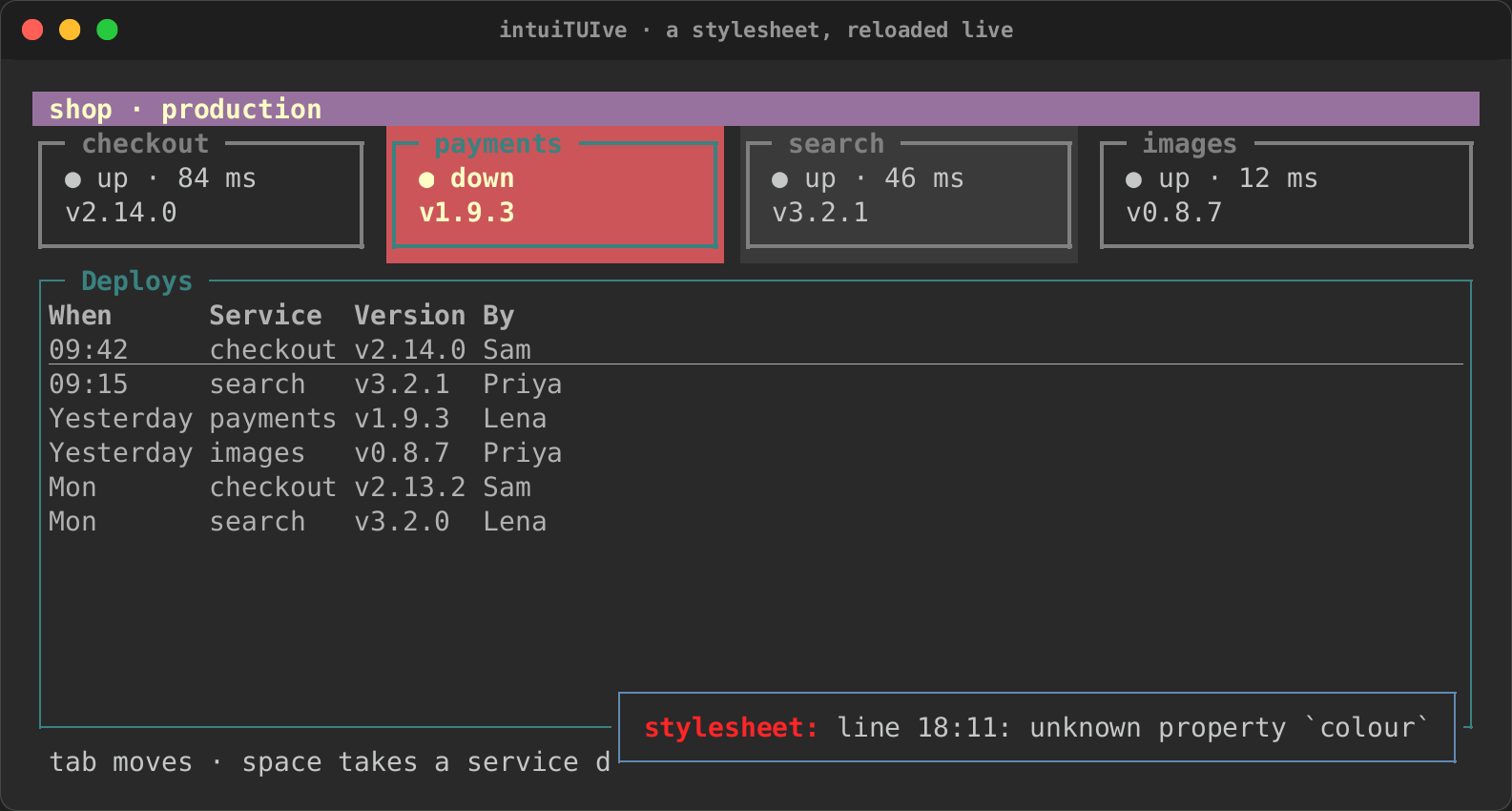
The styled example is a status page whose look is all in its sheet.
Given the sheet's path, it reads the file again whenever it changes:
/* The stylesheet of the `styled` example. Run
   `styled styled.tcss` and edit this file: the app reads it again
   when it changes. */

#title { dock: top; size: 1; padding: 0 1; background: $accent; color: white; text-style: bold; }
#status { dock: bottom; size: 1; padding: 0 1; color: $muted; }

#services { size: 4; gap: 1; }
.card { border: round grey50; padding: 0 1; }
.card:hover { background: grey23; }
.card:focus { color: $accent; text-style: bold; }
.down { color: red; }
.down:focus { background: red; color: white; }

#deploys { border: round $accent; border-title: Deploys; }
table { color: grey70; }
table:focus { color: white; }
The code names the nodes and gives them classes:
/// One service's card: a panel with the `card` class, and `down` while
/// the service is down.
fn card(service: Service, down: Signal<bool>) -> Node {
    text(move || {
        if down.get() {
            format!("● down\n{}", service.version)
        } else {
            format!("● up · {} ms\n{}", service.latency_ms, service.version)
        }
    })
    .panel(service.name)
    .class("card")
    .class_when("down", move || down.get())
    .focusable()
    .on_key("space", move |cx| {
        down.update(|d| *d = !*d);
        let now = if down.get_untracked() { "down" } else { "up" };
        cx.toast(format!("{} is {now}", service.name));
    })
}
The recording edits the sheet while the app runs: the borders and the title change, then a misspelt property is reported and the last good sheet stays.
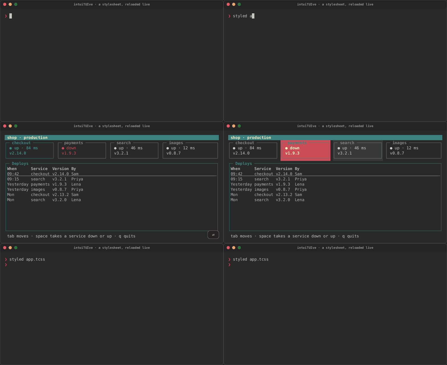
| Styled | :focus and :hover |
|---|---|
 |
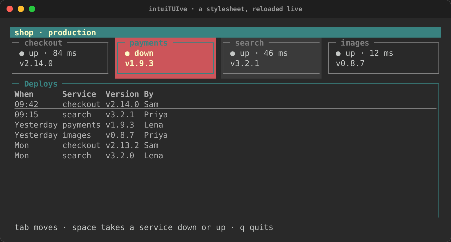 |
| Reloaded | A mistake |
 |
 |
Errors
.error_when(condition) puts a node in error while the condition holds: a
field whose value is wrong, a form that cannot be sent. Three things
follow, alongside the focus and :disabled:
- The theme gives it a look of its own, for every app: a panel draws
its border in the theme's
border.errorstyle, and another node's text takes the theme'serrorstyle, under the text's own colours as a stylesheet's go. Both are the theme'sbadstyle unless the theme (or a theme file) names them. - The stylesheet matches it with
:error, or CSS's:invalid. - Assistive technology is told it is invalid:
AccessState::invalid,invalidin linear mode's line,aria-invalidin a browser.