Screens, pop-ups and toasts
Everything that opens over an app: screens on a stack, modals, an app ending with a value or an error, pop-ups next to a node or at a point, prompts and pick lists, menus, confirmations, toasts and notifications, and animations. The command palette and the help are on State, keys and the mouse.
Screens and modals
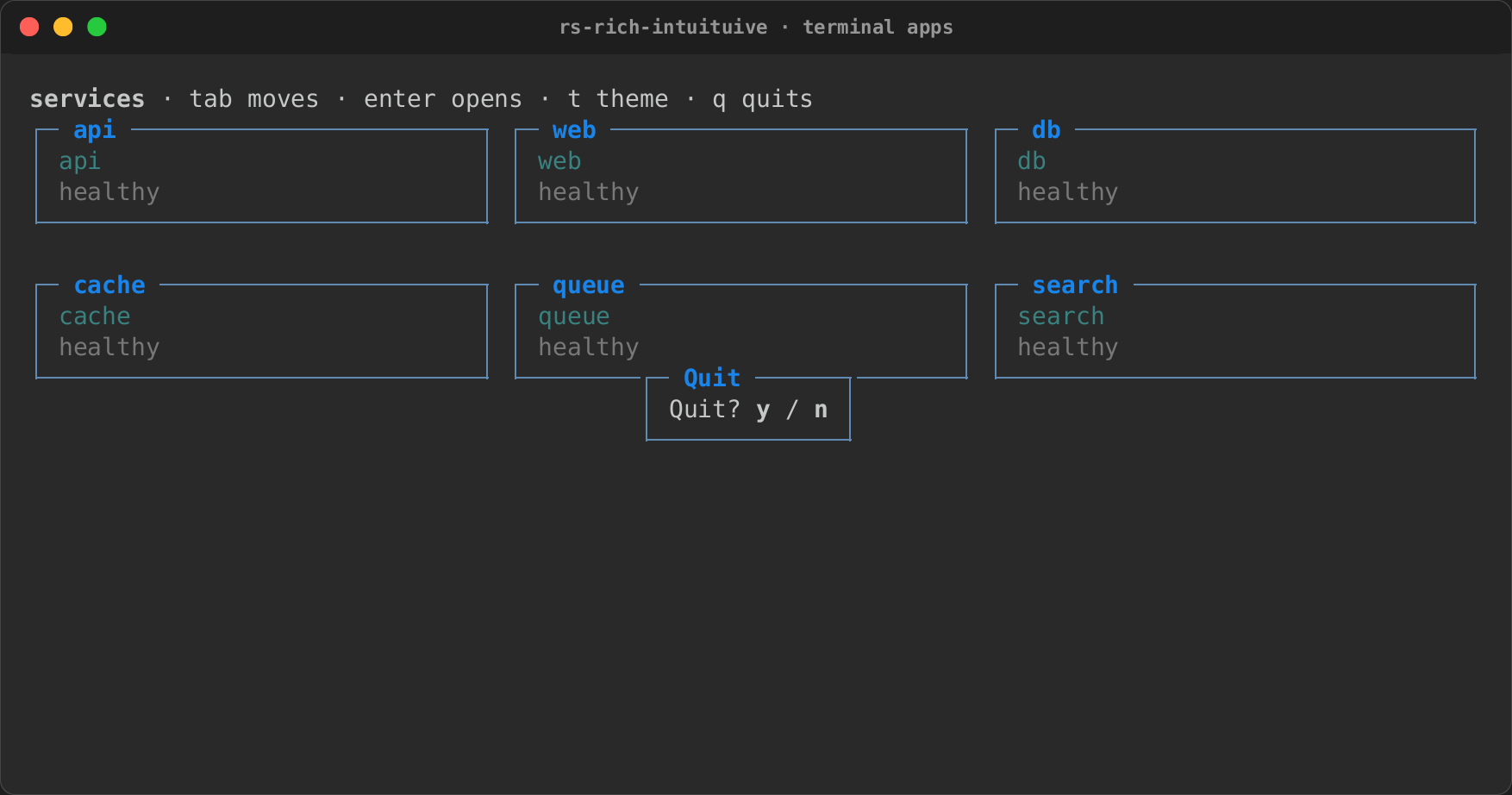
An app is a stack of screens. A handler opens one with cx.push, and
cx.pop goes back:
fn detail(id: u32) -> Node {
    let count = signal(0);
    text!("item {id}: {count}")
        .on_key("+", move |_| count.update(|c| *c += 1))
        .on_key("esc", |cx| cx.pop())
}

label("home").on_key("enter", |cx| cx.push(|| detail(7)))
- The screen below is kept, with its state and its focus, and comes back as it was.
- A screen's closure can create signals and call
every; its timers stop when it closes. cx.replace(build)swaps the top screen, as a wizard's steps do.App::min_size(w, h, message)shows a message instead of the app on a terminal that is too small (see Responsive layout).
A modal is a screen in a box over the one below, which keeps drawing:
.on_key("q", |cx| {
    cx.modal(Size::Auto, Size::Auto, || {
        label("Quit? [b]y[/] / [b]n[/]")
            .padding(0, 1)
            .panel("Quit")
            .on_key("y", |cx| cx.quit())
            .on_key("n esc", |cx| cx.pop())
    })
})
Its width and height are cells (Size::Fixed), a share of the screen
(Size::Percent), the content's size (Size::Auto), or the whole screen
(Size::Flex). Keys and clicks reach only the top screen.
cx.modal_with(width, height, options, build) takes ModalOptions: a
shadow, and a backdrop.
use intuituive::ModalOptions;

let look = ModalOptions::new().shadow("on grey11").backdrop("dim");
cx.modal_with(Size::Fixed(40), Size::Fixed(8), look, || confirm())
.shadow(style)restyles a strip one cell right and down of the box, as ratatui'sShadow::overlay().style(..)does..backdrop(style)restyles the whole screen below while the box is open, as it goes on drawing.- Styles are console styles or theme names.
cx.popup_with(..)takes the same options for a pop-up.
Ending with a value, or an error
let picked: Option<usize> = App::new(|| {
    let selected = signal(0usize);
    list(colours, selected).on_key("enter", move |cx| cx.quit_with(selected.get()))
})
.run_for()?;
cx.quit_with(value)ends the app with a value of any type, whichApp::run_for::<T>()returns (Nonewhen the app ended otherwise, or with another type).App::run_on_fordoes the same on any backend, andDriver::take_exit::<T>()gives it to a loop of your own.cx.fail(error)ends the app with an error, whichApp::run(andrun_on) returns once the terminal is given back. Anio::Errorkeeps its kind; anything else (aString, your own error) isOther.Driver::take_error()gives it to a loop of your own.App::try_new(|| -> Result<Node, E>)builds an app that can fail before it starts (a sound card that is not there): the error comes back fromtry_newitself, before the terminal is taken, somainreports it with?like any other. What the builder made is dropped, and itslatestthreads never start.
Screens that hand back a value
cx.push_for::<Choice>(|| picker(), |choice: Option<Choice>, cx| { /* .. */ });
cx.modal_for::<Choice>(Size::Auto, Size::Auto, || picker(), |choice, cx| { /* .. */ });
// inside the picker:
.on_key("enter", move |cx| cx.dismiss(Choice::A))
cx.dismiss(value)closes the top screen and handsvalueto the callback it was opened with, as Textual'sdismissdoes. A plain pop (cx.pop(), Esc on a pop-up) calls it withNone, and so does a value of another type.- The callback gets a
Ctx: it can open another screen, toast, or quit.cx.replace(..)of such a screen hands the callback on to the screen that takes its place, so a wizard's last step dismisses for all of them.
Modes
Several stacks of screens, each with its own history, as Textual's
App.MODES are:
App::new(home)
    .mode("chat", chat_screen)
    .mode("settings", settings_screen);

cx.switch_mode("settings");           // built on first use, then kept
cx.switch_mode(intuituive::DEFAULT_MODE);  // the stack App::new built
cx.mode()                             // "settings"
- The stack left keeps its screens, their state and their focus; switching back shows it as it was, the screen pushed last still on top.
- A stashed mode's timers do not fire while another mode shows. One that
came due fires once on the way back, then goes on in step. One-shot
cx.aftertimers and watches belong to the app and keep running. - An unknown name does nothing.
Maximizing a pane
A pane can take the whole screen for a while, as Textual's
Screen.maximize does:
row([files_pane(), diff_pane().maximizable()])
App::new(build).maximize_key("ctrl+m")   // off unless set
.maximizable()(or.maximizable_when(|| ..)) says which nodes may be maximized.cx.maximize()maximizes the nearest maximizable node on the focus's path (the focused node, or the pane round it);cx.maximize_node(id)maximizes that node;cx.minimize()restores.cx.is_maximized()says whether one is.- The node draws over the whole screen, keeping its state and its focus. The rest of the tree keeps its state but does not draw: clicks miss it, and Tab stays inside the maximized node. Signals written meanwhile redraw the hidden panes when the layout is restored.
- Esc that nothing used restores it, and so does the
maximize_keyagain. The inspector marks the node maximized, and assistive technology hears "maximized" and "restored".
Pop-ups
cx.popup(anchor, placement, width, height, build) opens a box like a
modal, but next to a node rather than in the middle of the screen: below,
above, right or left of anchor (a node's id()), flipped to the other
side when there is no room. Esc that nothing used, or a press outside it,
closes it. Dropdowns, menus and autocomplete lists start here.
let field = label("Colour: red").focusable();
let at = field.id();
field.on_key("enter", move |cx| {
    cx.popup(at, Placement::Below, Size::Fixed(12), Size::Auto, || {
        label("red\ngreen\nblue").panel("Pick").on_key("q", |cx| cx.pop())
    })
})
The anchor can also be a Rect of the screen, for a pop-up at a place
rather than a node: EventCx::rect() gives a widget its own, and
Ctx::pointer() gives where the mouse event being handled happened.
cx.popup_at(origin, offset, build) places a pop-up from a point of the
screen instead (Yazi's): an Origin (TopLeft, TopCenter, TopRight,
Center, BottomLeft, BottomCenter, BottomRight, or At(rect),
below a rectangle or above it when there is no room), moved and sized by
an Offset { x, y, w, h } (cells, negative to go left or up; the sizes as
a modal's). However far the offset, the pop-up stays on the screen: it is
moved back inside, and made smaller if it is larger. Below a rectangle
(Origin::At), a box wider than the room right of the rectangle is made
narrower first, to stay under it (down to the rectangle's width), and is
only moved left when even that does not fit: Yazi's 80-wide rename box
at 80 columns stays under the row. It closes as any pop-up does. Its
panel's .title_style(..) styles that pop-up's title instead of the
theme's popup.title (Yazi's input titles are plain, "default").
cx.popup_at(Origin::TopCenter, Offset::new(0, 2, 50, 3), move || {
    input(name).select(0..stem).panel("Rename:")
})
node.rect_handle(), taken while the tree is built, says where a node is
on the screen after each frame (None while hidden or scrolled out of
view); reading it with get() subscribes, so what reads it redraws when
the node moves. Origin::At(handle.get_untracked()?) puts a pop-up under
it. App state that wants the handle before the view is built makes one
with RectHandle::new() and gives it to the node later with
.rect_into(&handle).
Two presets build the usual pop-ups:
// Yazi's input: top centre, two rows down, 50 wide; Enter submits, Esc cancels.
cx.prompt("Rename:", name.get_untracked(), move |text, cx| rename(text, cx));
cx.prompt_with("Find:", "", PromptOptions::new()
    .at(Origin::At(row), Offset::new(0, 1, 50, 3))
    .caret(Caret::At(stem))
    .title_style("default")
    .on_change(move |text, _| query.set(text.to_string()))
    .on_cancel(move |_| query.set(String::new())),
    |text, cx| find(text, cx));
// Yazi's "Open with:": a short list below the hovered row.
cx.pick("Open with:", Origin::At(row), openers, move |i, cx| open_with(i, cx));
cx.prompt(title, initial, |text, cx| ..)is a one-line input in a box, the caret at the end.prompt_withtakesPromptOptions: where it opens (at(origin, offset), aspopup_at), the caret, a title style, and handlers for each edit and for Esc.cx.pick(title, origin, items, |index, cx| ..)is a list of markup items in a box as wide as the widest item (or the title) and as tall as the items; Enter or a click picks, Esc orqcloses it with nothing picked.pick_withtakesPickOptions: an offset and size, a title style.
Menus
use intuituive::menu::{context_menu, menu_bar, Menu, MenuItem};

column([
    menu_bar(vec![
        Menu::new("File", vec![
            MenuItem::new("Save", |cx| save(cx)).hint("ctrl+s"),
            MenuItem::separator(),
            MenuItem::new("Quit", |cx| cx.quit()),
        ]),
    ])
    .fixed(1),
    body.on_mouse(|cx, mouse| {
        if mouse.kind != MouseKind::Down(Button::Right) {
            return false;
        }
        context_menu(cx, vec![MenuItem::new("Copy", copy), MenuItem::new("Paste", paste)]);
        true
    }),
])
menu_bar(menus): ←/→ move between titles while it has the focus, and Enter, ↓ or a click opens a menu below its title.- A menu: ↑/↓ move past separators, Enter or a click runs an item
(the menu closes first, so the item may open a screen), the pointer
moves the selection, and Esc or a press outside closes it.
MenuItem::new(..).disabled("reason")is shown greyed, with the reason where a hint would be: the arrows and letters pass it by, and Enter or a click on it does nothing. context_menu(cx, items)opens at the pointer from a mouse handler, andopen_menu(cx, at, placement, items)next to a node or aRect.
Confirming
cx.confirm(title, body, items, on_yes) asks in the framework's look,
Yazi's way: a modal centred over the screen, the title on its top edge, the
body under it, the items (ten at most, and a count of the rest) between two
rules, and [Y]es and (N)o. y, or Enter on Yes, closes it and runs
on_yes; n, Esc, or Enter on No closes it; Tab and the arrows move
between the two, and a click picks one. With no body, the items sit right
under the title; with neither, only the answers show.
cx.confirm_with(title, body, items, ConfirmOptions::new().size(w, h)
.title_style("blue"), on_yes)
sizes the box (50 wide and as tall as its
content by default; Yazi's trash confirm is 70 x 20, the items taking
the room and the answers at the bottom) and styles its title.
Toasts and animations
cx.toast(markup)shows a message at the bottom right for three seconds, andtoast_for(markup, duration)for as long as you say. Toasts stack and do not take the focus. On a screen too small for a toast's box, the newest shows reversed on the bottom row.cx.notify(level, title, body)(notify_forwith a duration; five seconds by default) is a notification: a box with the title on its top edge and the body wrapped inside, its border and title in the level's style (Level::Info,WarnorError: the theme'snotify.info,notify.warnornotify.error, elseaccent,warnorbad). It is announced with its level (Error: Copy failed: …).App::toasts_at(corner)stacks toasts and notifications in another corner, newest nearest it:Corner::TopRightis Yazi's.App::notify_width(size): a notification is as wide as its body's longest line (and its title), 48 cells at most by default, and wraps beyond.Size::Fixed(n)orSize::Percent(p)of the screen lets a one-line error stay on one line.cx.animate(signal, to, duration, easing)moves aSignal<f64>totooverduration, setting it every frame, so whatever reads it moves with it: a split's ratio, a gauge, a scroll offset.EasingisLinear,EaseIn,EaseOutorEaseInOut(the cubic ones), or one of Textual's: sine, quad, cubic, quart, quint, expo, circ, back, elastic and bounce, eachIn…,Out…andInOut…(Easing::OutBounce,Easing::InOutBack);Easing::ALLlists them. A new animation of the same signal takes over from where it is. While one runs, the app draws at about 60 frames a second, and it goes back to waiting for input when they end.