Lists, trees and tabs
Lists (how they look, rows as a file manager draws them, a cursor kept by key, ranges, selections of several items, finding, reordering), trees (by path, by key, loaded a level at a time), split panes, tab strips and a model of a set of tabs, and logs. Tables are on Tables and scrolling.
Lists
list(items, selected) (see Nodes) is a scrolling list
with one selected row. Its options are below; list_lazy, list_rows and
virtual_list are lists for many rows.
How a list looks
use intuituive::widgets::{HighlightSpacing, ListDirection};

list(move || messages.get(), selected)
    .symbol("[red]>>[/] ")
    .repeat_symbol()
    .highlight_spacing(HighlightSpacing::Always)
    .direction(ListDirection::BottomToTop)
    .scroll_padding(1)
    .multiline()
    .row_style(|i| (i % 2 == 1).then(|| "on grey15".into()))
    .offset(first)
A list's options are builders on the node, as a text area's are. Call
them on the list itself (or a reorderable one), before .panel(..).
.symbol(markup),.highlight_spacing(..)and.repeat_symbol()(the symbol on every line of a multi-line item) are a table's, for a list..direction(ListDirection::BottomToTop)puts the first item at the bottom, the rest above it, as a chat or a log does. ↑ and ↓ still move up and down the screen; Home and End go to the first and the last item..multiline()keeps each item's lines and wraps them, rather than cutting the first with…..row_style(|i| …)styles itemi's whole rows, and.scroll_padding(n)keeps items in view round the selection..offset(signal)puts the first item in view in a signal you can read, or set to scroll; the selection is still kept in view.list_optional(items, selected)takes aSignal<Option<usize>>, astable_optionaldoes.list_lazy(len, item, selected)asks only for the items it draws, wherelist's closure builds every item on each draw: use it for a directory of a hundred thousand files. It takes every option below.- A list sized
.auto()is as wide as its widest item, with its symbol, marker and trailing columns (it looks at every item to know).
Rows as a file manager draws them
use intuituive::widgets::RowRects;

let rects = RowRects::new();
list(move || names.get(), cursor)
    .trailing(move |i| sizes.with(|s| s[i].clone()))
    .marker(move |i| marked.with(|m| m.contains(&i)).then(|| "on yellow".into()))
    .row_style(move |i| Some(colour(i).into()))
    .selected_style_for(move |i| Some(format!("reverse {}", colour(i))))
    .scroll_padding(5)
    .row_rects(&rects)
// later, in a handler: a popup under the selected row
// cx.popup(rects.get(cursor.get()).unwrap(), Placement::Below, ..)
.trailing(|i| markup)draws markup at the right of itemi's row, right-aligned, and cuts the item short of it: Yazi's line mode (sizes, times) in the same list as the names. It is inside the row, so the row's style and the highlight cover it. Empty markup shows none..marker(|i| Option<style>)keeps a one-cell column at the left of the rows, outside the row style and the highlight, and fills itemi's cell with the style it returns (or leaves it blank): selected, visual and yanked markers. The column is kept with nothing marked, so the text never moves when a mark comes or goes..selected_style_for(|i| Option<style>)is the highlight's style when itemiis selected, instead of the theme'sselected: a different look per row (the preview's underline). A bar in each row's own colour needs none:.row_styleof the colour and areverseselectedreverse it already..highlight_layer(HighlightLayer::Under)puts the highlight under the item's markup rather than over it, so what the markup styles keeps its own style on the selected row: Yazi's rounded ends ([not reverse blue]\u{e0b6}[/]) outside the reversed name..wheel_step(n)moves the selectionnitems a turn of the wheel (three by default);0leaves the wheel to the list's ancestors, whoseon_mouseotherwise never sees it..row_rects(&rects)records where each row in view was drawn on the screen, so a handler can open a popup at a row:rects.get(i)is itemi's rectangle, orNoneout of view. Tables andvirtual_listtake it too.
list_lazy's closures, and those of .trailing, .marker and
.row_style, each read the app's data again for the same row.
list_rows(len, |i| ListRow, selected) asks one closure per row and
makes each row once a draw, its parts together:
use intuituive::widgets::{list_rows, ListRow};

list_rows(move || files.with(Vec::len), move |i| {
    files.with(|f| {
        let entry = &f[i];
        ListRow::new(entity(entry))
            .trailing(linemode(entry))
            .marker(marker_style(entry))
            .style(row_style(entry))
    })
}, cursor)
.marker_column()
.marker_column() keeps the marker column, filled from each row's
marker; every other list option still applies.
List options through a wrapper
A list's options (.symbol, .highlight_layer, .wheel_step,
.selected_style_for, .marker, .on_context, .cursor_by, …) reach
the list a node wraps: a panel, padding, a reorderable list (a node with
one child), and a switch, whose lists get them as they are built, so a
list with a "No items" text in its place keeps them. On a node that is
not a list and wraps none, they do nothing, and a debug build says so on
stderr, once for each option.
The cursor by key, and a context menu
list(move || names(), cursor)
    .cursor_by(move |i| entries.with(|e| e[i].id))
    .on_context(move |i, cx| open_menu(i, cx))
.cursor_by(|i| key) keeps the cursor on the same item when the
items change: re-sorted, filtered, read again. The key of the item under
the cursor is remembered; when the key now at its index differs, the
selection goes to wherever it went. Moving the cursor is unchanged.
.on_context(|i, cx| ..) runs on a right press on an item (which
selects it first, and goes no further) or the menu key (menu, which
terminals with the kitty keyboard protocol report, or Shift+F10) on the
selected item: place the menu at cx.pointer(), or at the row's
row_rects from the keyboard.
A range of rows
.range(anchor) gives a list a range from an anchor to the cursor:
Shift with ↑/↓, PgUp/PgDn or Home/End sets the anchor where the cursor
was and moves the cursor, a move without Shift clears it, and the rows
between are lit in the theme's selected.range style. Read it as
anchor..=cursor, either way round. A list without a range leaves Shift
with a move to its ancestors.
Picking several items, and finding in a list
use intuituive::{list_search, multi_select};

let picked = multi_select::<String>()
    .over(move || names.get())                // the items' keys, in order
    .range_from(cursor);                      // what a visual range follows
let find = list_search(move || query.get(), move || names.get(), cursor);
list(move || names.get(), cursor)
    .selection_markers(picked, move |i| names.with(|n| n[i].clone()))
    .on_key("space", move |_| picked.toggle(hovered()))
    .on_key("v", move |_| picked.visual(false))
    .on_key("V", move |_| picked.visual(true))
    .on_key("esc", move |_| picked.end_visual())
    .on_key("n", move |_| { find.next(); })
multi_select::<K>()is a selection by key that outlives the list's order:toggle,select,unselect,clear, and over the itemsselect_allandinvert.visual(unset)anchors a range at the cursor that follows it, selecting (or, withunset, unselecting) what it covers, as vim's and Yazi'svandV;end_visual()keeps it,cancel_visual()drops it.selected()is the selection with the range counted,targets(hovered)the selection or else the hovered item (what a copy or a delete acts on),mark(&key)how one key stands.Copy, like a signal..selection_markers(sel, |i| key)draws the marks in a list's one-cell marker column:marker.selected(yellow),marker.visual(cyan) andmarker.unset(red) in the theme; a.marker(..)still shows where an item has no mark.list_search(query, items, cursor)finds over a list's items (their plain text) in smart case: lower case matches either case, a capital exactly.next()andprevious()move the cursor and wrap,place()is(n, of)for a2/5count (0 off a match),matches()andis_match(i)for a highlight.- Marks by key:
list.marks_by(selection, |i| key)draws amulti_select's marks on a list that is not the one it is over (a parent column, a second view, a search's results), finding each item by key, a visual range too. - Find from here:
search.next_from(true)(andprevious_from) stays on the hovered item when it matches, as find as you type does;falseisnext.
Reorderable lists
use intuituive::widgets::Move;

let items = signal(vec!["build".to_string(), "test".into(), "deploy".into()]);
list(move || items.get(), signal(0usize))
    .reorderable(move |step: Move, _| items.update(|items| step.apply(items)))
.reorderable(on_reorder) on a list lets the user put its items in
order (#720). The app keeps the items, so each Move { from, to } comes to
on_reorder to make in them (Move::apply does it on a Vec), and the
selection follows the item.
- Alt+↑/↓ or Ctrl+↑/↓ move the selected item a place, and Alt or Ctrl
with Home/End to the top or the bottom. These need a terminal that
reports modifiers on those keys: most do, and any with the kitty keyboard
protocol.
KandJmove it in any terminal. - Space grabs it: the arrows (
k/j), PgUp/PgDn and Home/End then carry it, Space drops it, Esc puts it back where it was, and any other key drops it and does what it does (Enter reaches your binding). - A press selects a row and a drag carries it; below the last row shown, the list scrolls. The mouse is held for the drag, so letting go outside the list still ends it.
- The carried row is marked
↕, so it shows without colour.
The keys are seen before the list's own (the reorder wraps the list and
previews its keys), so the plain arrows still only select. Call it on the
list itself, before .panel(..): on a node that is not a list (a
virtual_list, a table, a panel), .reorderable does nothing.
Rows that are nodes
list and list_rows draw markup rows. list_of takes rows made of any
nodes (a card, a row with a label and a button), as Textual's ListView
does, with the list's cursor:
list_of(move || sessions.with(Vec::len), move |i| session_card(i), selected)
    .item_key(move |i| sessions.with(|s| s[i].id))      // rows keep their state by key
    .separator_after(move |i| i + 1 == pinned.get())     // a rule under item i
    .item_disabled_when(move |i| sessions.with(|s| s[i].closed))
    .on_highlight(|i, cx| { /* the cursor moved to i */ })
    .on_select(|i, cx| { /* Enter, or a click on row i */ })
    .on_context(|i, cx| { /* a right click on row i */ })
    .scroll_padding(1)
- ↑/↓, Home/End and PgUp/PgDn move the cursor and keep it in view;
separators and disabled rows are skipped, and disabled rows draw dim and
match
:disabled. The wheel scrolls the view. - A click on a row selects it, unless a node inside the row took the click: a card's button runs the button.
- The selected row matches
:selected, so a stylesheet styles its children::selected .title { text-style: bold; }. - All rows are built and laid out, as a
scroll's content is; for long lists, usevirtual_listorscroll_virtual.
Trees, split panes and virtual lists
use intuituive::widgets::{hsplit, tree, virtual_list, TreeItem};

let path = signal(Vec::<usize>::new());
let ratio = signal(0.3);
hsplit(
    tree(|| vec![TreeItem::new("src").children([TreeItem::new("main.rs")])], path),
    virtual_list(|| 100_000, |i| format!("line {i}"), signal(0usize)),
    ratio,
)
tree(items, selected)shows nestedTreeItems with the selection as a path of indices. ↑/↓ move, → expands, ← collapses or goes to the parent, Enter or Space toggles, and a click on an arrow toggles it.tree_withputs the expanded paths in a signal of your own. Keys a leaf does not use (Enter on it, ← at the top) bubble up to your bindings.-
hsplit(first, second, ratio)puts two panes side by side, andvsplitstacks them. Dragging the divider moves it, and so do Alt+←/→ (Alt+↑/↓ when stacked) from inside either pane.split_withsets the smallest size of a pane (three cells by default). A hidden pane (hide_below,display: none) leaves the other the whole split, with no divider. -
virtual_list(len, row, selected)is the list form ofvirtual_table: it asks only for the rows in view..scroll_padding(n),.row_style(|i| …),.offset(signal)and.row_rects(&rects)work on it as on a list. cell(markup)is a table cell outside a table: one line, cut at its edge, never wrapped. Arowof cells with.percent(..)widths and.gap(1)is a one-row table, each cell drawing only when what it reads changes, as scope-tui's header.tree_lazy(roots, children, selected)loads each level when it is opened.children(key)runs on another thread, so it can read a directory or ask a server, and returns the level'sLazyItems (LazyItem::leaforLazyItem::branch). The tree shows "loading…" until they arrive, and shows an error in red if loading fails.selectedholds the key of the selected item.tree_lazy_with(roots, children, selected, loads)keeps what loaded in aLazyTree, whosereload(key)andreload_all()load a level again (a file deleted under an open folder).tree_keyed(items, selected, expanded)keeps the selection and the open items by eachTreeItem's key (TreeItem::keyed(key, label)), not its place: a file staged moves every row after it, and the tree stays on its item with its folders open. An item that goes leaves the cursor at its row.tree_reveal(&items, key, selected, expanded)opens a key's ancestors and selects it.TreeItem::prefix(markup)is drawn before the indent (gitui's status letters),.symbol("🦄 ")before the selected row, and.tree_keys(TreeKeys::default().no_toggle())(orno_letters,no_open_close) leaves those keys to the tree's ancestors.
A tree kept by key, so it stays on its item while its rows change under it (gitui's status tree):
use std::collections::HashSet;
use intuituive::widgets::{tree_keyed, tree_reveal, TreeItem, TreeKeys};

let selected = signal(None::<String>);
let expanded = signal(HashSet::<String>::new());
let items = move || {
    vec![TreeItem::keyed("src", "src").children([
        TreeItem::keyed("src/lib.rs", "lib.rs").prefix("[green]M[/] "),
        TreeItem::keyed("src/main.rs", "main.rs").prefix("[red]D[/] "),
    ])]
};
tree_keyed(items, selected, expanded)
    .tree_keys(TreeKeys::default().no_toggle())   // Enter and Space are the app's
    .on_key("enter", move |_| stage(selected.get()))
    .on_key("ctrl+g", move |_| {
        tree_reveal(&items(), "src/main.rs", selected, expanded); // false: no such key
    })
Tabs
How a tab strip looks
tabs(|| vec!["Recipe".into(), "Email".into(), "Traceroute".into()], tab)
    .divider(" • ")
    .tab_padding("", "")
    .titles_align(Align::Center)
.divider(markup) goes between the titles instead of │ ("" for
none), in the theme's tabs.divider style; .tab_padding(left, right)
replaces the space either side of each title; and .titles_align(..)
puts the strip at the start, the centre or the end of its width. Clicks
find the right title whatever the divider and padding.
.auto_hide() hides the strip while it has fewer than two titles (it
takes no row then), and .on_select(|to, cx| ..) is told the title a
click, ←/→ or a number key picked, instead of the strip setting its
signal: the app moves there its own way and sets the signal itself, with
no click routing of its own. .fit() cuts the titles with … to
share the width when they do not all fit (the short ones whole, the long
ones to an equal share), rather than losing the last off the end; titles
not selected are drawn in the theme's tabs.unselected style, under their
own markup.
A set of tabs
use intuituive::{tab_set, tabs_for};

let pages = tab_set(|| Page::new());          // one tab to start
column([
    tabs_for(&pages, |page| page.title()).fit().fixed(1),
    text(move || pages.with_active(|page| page.body())),
])
.on_key("t", move |_| { pages.open(); })      // after the active one
.on_key("x", move |_| { pages.close_active(); })
.on_key("shift+right", move |_| pages.swap(1))
.on_key("tab", move |_| pages.cycle(1))
tab_set(|| state) keeps one state per tab with one active, the
model Bubble Tea apps and Textual's TabbedContent keep: open() (a
state from the closure) and open_with(state) add a tab after the active
one and make it active, close(i) and close_active() never close the
last, switch(i), cycle(by) (wrapping) and swap(by) (the active tab
moves); active() and tabs() are its signals, with_active,
update_active and update(i, ..) read and change a state. A state is
anything: plain values, or signals made for the tab (a cwd and its
history). tabs_for(&set, |state| title) is a tabs strip over it,
a click or a key switching tabs; it takes every strip option.
- Numbered tabs:
tabs_for_indexed(&set, |i, state| title)gives the title closure each tab's index, for Yazi's1 src. - A value per tab:
set.scoped(|| signal(String::new()))keeps a value for each tab of atab_set, made the first time a tab asks:scoped.get()is the active tab's (a draft, a scroll position, a handle), switching with the tab; a closed tab's goes. Tabs have identities that stay through opens, closes and swaps (active_id(),ids()). To keep one handle and switch what it holds,multi_select().scoped(&set)gives each tab its own chosen keys and visual range behind the sameMultiSelect, so a list's markers and an action's targets follow the active tab, as Yazi's per-tab selection.
Logs
let log = Log::new(1_000);           // keeps the last 1,000 lines
log.push("[green]started[/]");
log.view().panel("Log")
A log renders each line once. On an append it moves the rows already on screen up and renders only the new lines. That is why a log tail costs less than redrawing every row, which is ratatui's approach.
The lines it keeps are its scrollback: Log::new(capacity) drops the
oldest past it, and set_capacity(n) changes it later. The view follows
the newest line until it is scrolled back, then stays where it is while
lines arrive below it; End, or scrolling down to the last line, follows
again. is_following(), follow() and unseen() (the lines that arrived
below the view) are what a status line shows.
| Key | Does |
|---|---|
↑ ↓ (k j) |
a line back or on |
| PgUp PgDn | a page |
Home (g) |
the oldest line kept |
End (G) |
follow the newest line again |
| the wheel | three lines; works over the log without the focus |
| the scrollbar | .scrollbar(Scrollbar::new()): dragging the thumb scrolls |
Keys reach the log while it has the focus, so make it
log.view().focusable(). A key it cannot use (↑ in a log that fits) goes
on to its ancestors' bindings.
Tables, code and panels in a log
New in 0.0.24: log.write(renderable) adds any rich renderable, as
Textual's RichLog.write does: a tool's table, an excerpt of a file as
highlighted code, a panel, a diff.
log.write(rich::Syntax::new(code, "rust"));
log.write_with(table, LogLine::new("").level(Severity::Info).target("tool"));
- An entry is laid out at the view's width when it is drawn, and again
when the width changes, only while it is in view. A level, target or
markup given with
write_withgoes on a row above it. - The capacity counts it as one line, and a filter matches the words of its plain text (laid out 100 columns wide).
- While the log holds one, the view draws its rows in full rather than moving them up, and the keys scroll by entries: ↑ shows the entry before at the bottom, Home the first at the top. A tall entry arriving at the end is followed, its top cut off when it is taller than the view.
Levels, targets and filters
A line may carry a level and a target, the module that wrote it:
use intuituive::log::{LogLine, Severity, TargetLevel};

log.push_line(LogLine::new("disk [b]full[/]").level(Severity::Error).target("app::store"));
log.push_line(LogLine::text("[raw] brackets as written").level(Severity::Debug));

log.set_level(Some(Severity::Warn));                     // warn and above
log.set_target_level("hyper", TargetLevel::Off);         // hyper and hyper::*
log.set_target_level("app::db", TargetLevel::From(Severity::Debug));
log.set_filter("timeout or level:error")?;               // a query
The view puts the level, in rich's logging.level.<name> theme styles,
and the target, in log.target (dim), before the message;
show_level(false) and show_target(false) leave them out. A line with
no level passes every level filter.
- Level:
set_level(Some(level))keeps lines at that level and above. - Targets:
set_target_level(target, level)covers the target and the ones under it (appcoversapp::db, notapple), and the most specific setting wins.TargetLevel::Inheritgoes back to the log's level.targets()lists the targets seen, with their line counts. - Text:
set_filter(text)reads a query inlog::filter_grammar(): words in the message (ignoring case),level:warn,target:app::db(from the start of the target),and,or,not, parentheses. Wire a box to it withwatch(move || filter.get(), move |text, _| { let _ = log.set_filter(&text); }).
Filters apply to lines already kept and to every line that arrives, and
the view scrolls by the lines that show. shown() counts them.
log.targets_view() is a panel of the targets seen, like tui-logger's:
↑ and ↓ choose a target, ← shows less of it and → more (off, error, warn,
info, debug, trace), Space turns it off or back on, and Backspace gives it
back to the log's level. It is focusable and takes clicks and the wheel.
For assistive technology a log's role is log, and its accessible text is
the newest line in view; the targets panel is a list whose selected item
reads as app::db: debug and above.
With the off-by-default tracing feature a log shows the app's own
tracing events: see Logs from tracing.
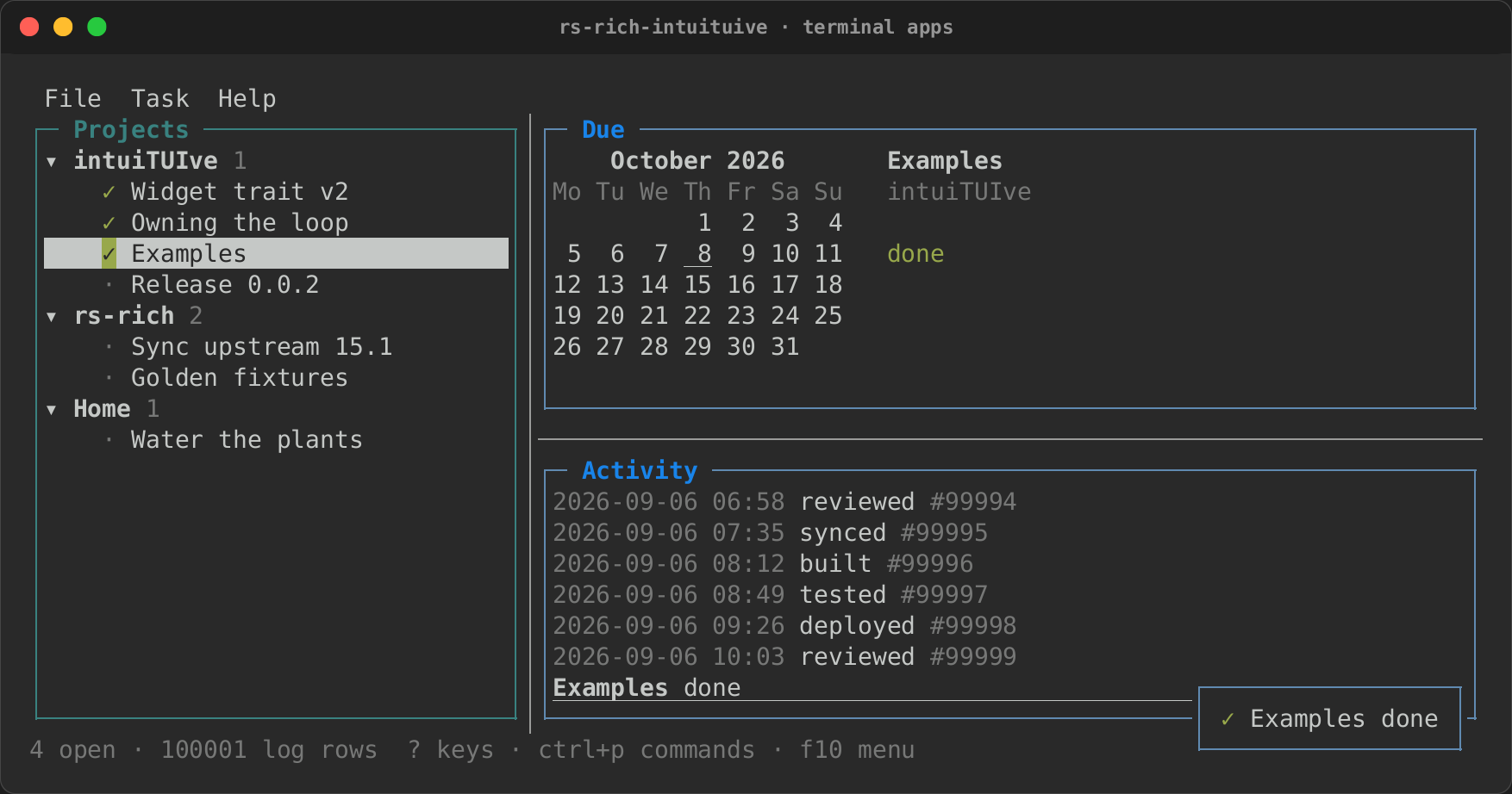
The planner example puts them together under a menu bar: projects and
their tasks in a tree, the selected task's due date on a calendar, and a
log of a hundred thousand rows, in panes whose dividers drag
(cargo run -p rs-rich-intuituive --example planner).