Layout
The layout renderables arrange other renderables: put a border around them,
pad them, align them, place them side by side, or divide the screen into
regions. Each one wraps a child given as a Box<dyn Renderable>, so they nest
in any combination.
| Type | Does | Upstream |
|---|---|---|
Panel |
a border with a title | rich.panel.Panel |
Padding |
blank space around a child | rich.padding.Padding |
Align |
left, centre or right within the width | rich.align.Align |
Columns |
items packed into as many columns as fit | rich.columns.Columns |
Rule |
a horizontal line with an optional title | rich.rule.Rule |
Layout |
split the screen into rows and columns | rich.layout.Layout |
Constrain |
cap a child's width | rich.constrain.Constrain |
Styled |
apply a style under a whole child | rich.styled.Styled |
The examples use these imports:
use rich::r#box::{self as boxes, Box as BoxSet, DOUBLE, HEAVY};
use rich::{
    Align, Cell, Columns, Console, Constrain, HorizontalAlign, Layout, Padding, Panel, Renderable,
    Rule, Style, Styled, Table, Text,
};
Panel
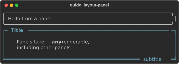
fn panels(console: &Console) {
    // The smallest panel: any renderable, boxed.
    console.print(&Panel::new(Box::new(Text::new("Hello from a panel"))));

    // Titles and subtitles are markup, and can be aligned.
    let body =
        Text::from_markup("Panels take [b]any[/b] renderable,\nincluding other panels.").unwrap();
    let panel = Panel::new(Box::new(body))
        .title("[bold]Title[/]")
        .title_align(HorizontalAlign::Left)
        .subtitle("subtitle")
        .subtitle_align(HorizontalAlign::Right)
        .box_set(DOUBLE)
        .padding((1, 4, 1, 4)) // top, right, bottom, left
        .border_style(Style::parse("cyan").unwrap());
    console.print(&panel);
}
| Method | Default | Effect |
|---|---|---|
title(markup), subtitle(markup) |
none | text in the top and bottom border |
title_align(..), subtitle_align(..) |
Center |
HorizontalAlign::Left, Center, Right |
box_set(BOX) |
ROUNDED |
the border characters (gallery) |
padding((top, right, bottom, left)) |
(0, 1, 0, 1) |
space between border and content |
border_style(Style) |
none | style of the border and title line |
A panel fills the width it is given. Panel::fit(child) sizes it to its
content instead, as upstream's Panel.fit does, and .width(n) fixes it.
Padding
fn padding(console: &Console) {
    let text = || Box::new(Text::new("padded")) as Box<dyn Renderable>;
    let shaded = Style::parse("on grey23").unwrap();

    console.print(&Padding::new(text(), (1, 2, 1, 8)).style(shaded.clone()));
    console.print(&Padding::uniform(text(), 1).style(shaded.clone()));
    console.print(&Padding::symmetric(text(), 0, 4).style(shaded));
}
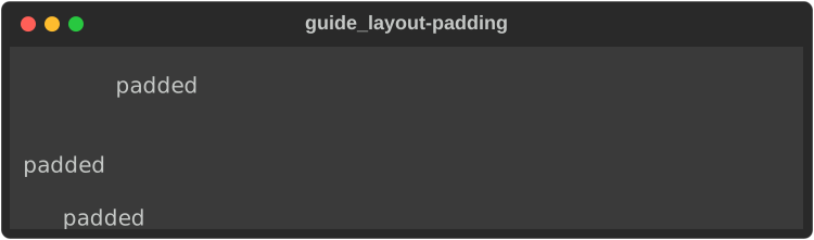
Padding::new(child, (top, right, bottom, left))— CSS order, like upstream.Padding::uniform(child, n)andPadding::symmetric(child, vertical, horizontal)..style(s)styles the padding (and the blank lines above and below).
Align
fn align(console: &Console) {
    let label = |s: &str| Box::new(Text::styled(s.to_string(), "reverse")) as Box<dyn Renderable>;
    console.print(&Align::left(label(" left ")));
    console.print(&Align::center(label(" center ")));
    console.print(&Align::right(label(" right ")));

    // Align works on any renderable with a natural width, such as a table.
    let mut table = Table::new();
    table.add_column("centred table");
    table.add_row(&["cell"]);
    console.print(&Align::center(Box::new(table)));
}
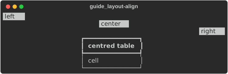
Align renders its child, then places the resulting block of lines within
the width. It works on anything narrower than the width — text, a table, a
tree. A child that fills the width (a Panel) has nothing to align;
Constrain it first.
Columns
fn columns(console: &Console) {
    let crates: Vec<String> = [
        "rs-rich",
        "rs-rich-ext",
        "rs-rich-cli",
        "rs-rich-art",
        "rs-rich-macros",
        "syntect",
        "serde_json",
        "pulldown-cmark",
        "fancy-regex",
        "terminal_size",
    ]
    .iter()
    .map(|name| name.to_string())
    .collect();
    // As many columns as fit, filled row by row.
    console.print(&Columns::new(crates));
}

Columns::new(Vec<String>) fits as many columns as the width allows, filling
row by row with a one-space gap. Items are plain text (not markup). For
columns of other renderables, use Layout::split_row or a
Table::grid().
Rule
fn rules(console: &Console) {
    console.print(&Rule::line());
    console.print(&Rule::new("[b]Centred title[/b]"));
    console.print(&Rule::new("Left").align(HorizontalAlign::Left));
    console.print(
        &Rule::new("Custom")
            .align(HorizontalAlign::Right)
            .characters("=-")
            .style(Style::parse("magenta").unwrap()),
    );
}

Rule::line()has no title;Rule::new(markup)has a centred one..align(HorizontalAlign::Left | Right)moves the title..characters("=-")repeats any string;.style(s)styles the line (default theme name:rule.line).
Layout
Layout
divides a fixed-size region into rows and columns, like a tiling window
manager. A leaf holds a renderable; a branch splits its space among children.
fn layout(console: &Console) {
    let panel = |title: &str, body: &str| -> Layout {
        Layout::with_renderable(Box::new(
            Panel::new(Box::new(Text::new(body.to_string()))).title(title.to_string()),
        ))
    };

    let mut body = Layout::new();
    body.split_row(vec![
        panel("Sidebar", "ratio 1").ratio(1),
        panel("Main", "ratio 3, so three times as wide").ratio(3),
    ]);

    let mut root = Layout::new();
    root.split_column(vec![
        panel("Header", "size 3: exactly three rows").size(3),
        body.ratio(1).minimum_size(4), // takes what is left
        Layout::with_renderable(Box::new(Text::styled("footer: size 1", "dim"))).size(1),
    ]);

    // A layout fills the height it is given: the console's height by default,
    // or an explicit height in the render options.
    let mut options = console.options();
    options.height = Some(12);
    console.print_with(&root, &options);
}
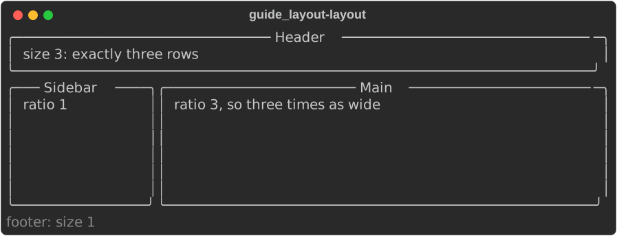
split_column(children)stacks children top to bottom;split_row(children)places them left to right.- Each child takes
.size(n)(fixed rows or cells), or a share of what is left by.ratio(n)(default 1), never less than.minimum_size(n)(default 1). - Every leaf is rendered at exactly its region's width and height: content is cropped or padded to fit.
- A layout fills a height:
options.heightwhen set (as above, viaprint_with), otherwise the console's full height. Printing one with the default options fills the whole screen — usually what you want for a full-screen display, rarely what you want inline.
Layout is the core of a full-screen dashboard: redraw it in a
Live display on each update.
Constrain and Styled
fn constrain_and_style(console: &Console) {
    // Constrain caps the width a child may use. Panels fill the width they
    // are given, so this is how to get a narrow one.
    let panel = Panel::new(Box::new(Text::new("at most 30 cells wide")));
    console.print(&Constrain::new(Box::new(panel), Some(30)));

    // Styled lays a style under everything its child renders.
    let panel = Panel::new(Box::new(
        Text::from_markup("[b]white on blue[/b], borders too").unwrap(),
    ));
    let styled = Styled::new(Box::new(panel), Style::parse("white on dark_blue").unwrap());
    console.print(&Constrain::new(Box::new(styled), Some(40)));
}
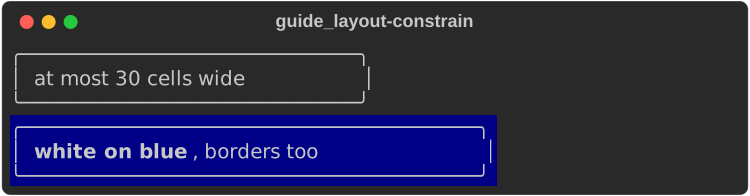
Constrain::new(child, Some(width))renders the child at no more thanwidthcells (Noneleaves it alone). It is how you get a panel, rule or table narrower than the terminal.Styled::new(child, style)laysstyleunder every segment the child renders; the child's own styles still win where they are set.
Box styles
Panels and tables draw their borders from a
Box — a set of
characters for each edge, corner and divider. The constants in
rich::r#box, drawn as
small tables so the header separator shows:
fn box_gallery(console: &Console) {
    let sets: [(&str, BoxSet); 20] = [
        ("ASCII", boxes::ASCII),
        ("ASCII2", boxes::ASCII2),
        ("ASCII_DOUBLE_HEAD", boxes::ASCII_DOUBLE_HEAD),
        ("SQUARE", boxes::SQUARE),
        ("SQUARE_DOUBLE_HEAD", boxes::SQUARE_DOUBLE_HEAD),
        ("MINIMAL", boxes::MINIMAL),
        ("MINIMAL_HEAVY_HEAD", boxes::MINIMAL_HEAVY_HEAD),
        ("MINIMAL_DOUBLE_HEAD", boxes::MINIMAL_DOUBLE_HEAD),
        ("SIMPLE", boxes::SIMPLE),
        ("SIMPLE_HEAD", boxes::SIMPLE_HEAD),
        ("SIMPLE_HEAVY", boxes::SIMPLE_HEAVY),
        ("HORIZONTALS", boxes::HORIZONTALS),
        ("ROUNDED", boxes::ROUNDED),
        ("HEAVY", HEAVY),
        ("HEAVY_EDGE", boxes::HEAVY_EDGE),
        ("HEAVY_HEAD", boxes::HEAVY_HEAD),
        ("DOUBLE", DOUBLE),
        ("DOUBLE_EDGE", boxes::DOUBLE_EDGE),
        ("MARKDOWN", boxes::MARKDOWN),
        ("NONE", boxes::NONE),
    ];
    // Each sample is a small table, so the header row separator shows too.
    let mut grid = Table::grid().padding(0, 2, 1, 0);
    for _ in 0..4 {
        grid.add_column("");
    }
    for chunk in sets.chunks(4) {
        let row = chunk
            .iter()
            .map(|(name, set)| {
                let mut sample = Table::new().box_set(*set).show_lines(true);
                sample.add_column(*name);
                sample.add_row(&["cell"]);
                sample.add_row(&["cell"]);
                Cell::Renderable(Arc::new(sample))
            })
            .collect();
        grid.add_row_cells(row);
    }
    console.print(&grid);
}
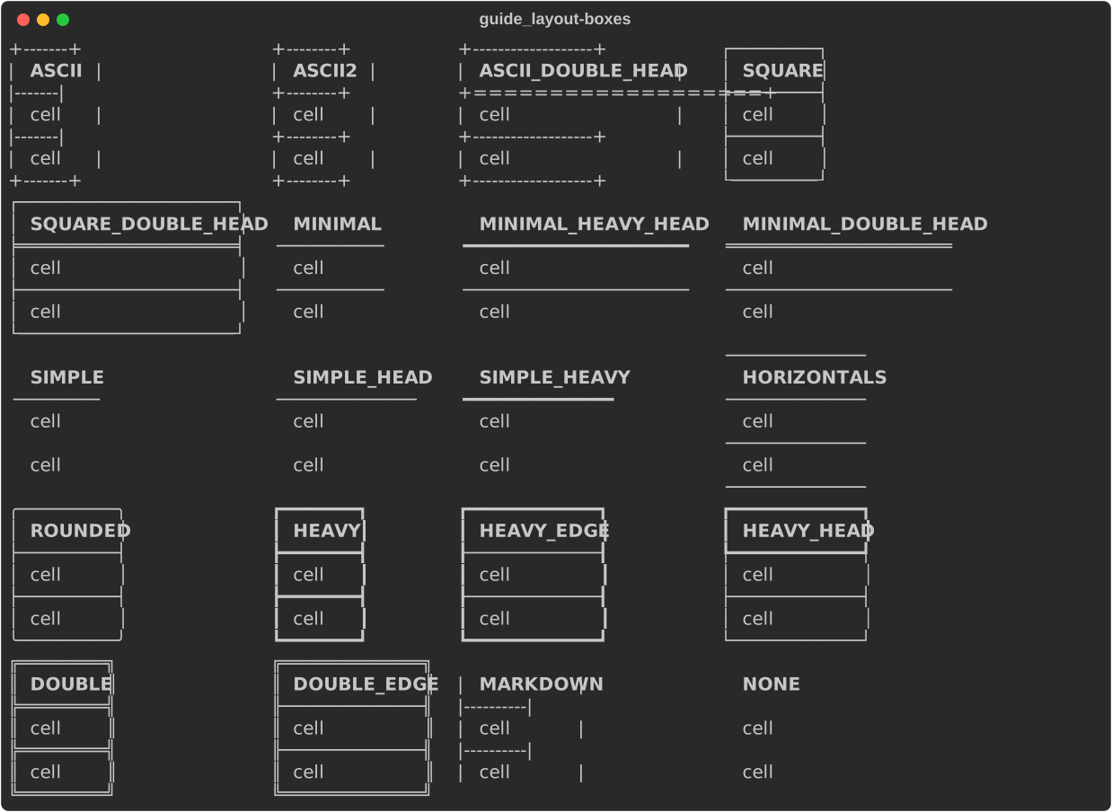
A panel uses only the outer edges; the head and row separators matter for tables.
Not yet ported
Panel:height,style,highlight.Align: vertical alignment,width,style.Columns:column_first,right_to_left,align,title, custom padding.Layout: named regions (layout["body"]),visible,update, and the placeholder drawn for an empty region (it renders blank — divergence #11).Rule:end.