Accessibility
Terminal output is often read by people who cannot rely on colour, borders
or animation. Screen-reader users hear box-drawing characters read aloud.
Colour-blind users cannot tell red from green. Some users turn motion off.
rich_ext::a11y has three parts:
- Semantic text (
AccessibleText): the content of a table, tree, panel, rule, text or diagnostic in reading order, without decoration. - Policies (
AccessibilityPolicy): the user's preferences, read fromRICH_A11YandNO_COLOR, applied to themes, fidelity and status symbols. - Theme checks (
check_theme): WCAG contrast, styles that differ only by colour, and pairs that look alike under colour vision deficiencies.
The examples come from
guide_a11y.rs.
The module needs no feature; the JSON form of findings needs serde:
Semantic text
A table as the eye sees it:
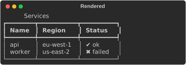
accessible_text(width) returns the same content as linear, undecorated
text. Tables name their columns in each row, trees become indented lists,
panels keep their title, and links read as text <url>:
fn show_semantic(console: &Console) {
    let table = services();
    let mut tree = Tree::new("deploy");
    tree.add("build").add("compile");
    tree.add("upload");
    let panel = Panel::new(Box::new(Text::new("All checks passed"))).title("CI");
    let link = Text::from_markup("See the [link=https://ci.example/42]build log[/].").unwrap();
    let diagnostic = Diagnostic::error("mismatched types")
        .code("E0308")
        .location(Location::new("src/main.rs", Some(4), Some(18)))
        .help("change the type to `u64`");

    // The same content, in reading order, without borders or guides.
    for text in [
        table.accessible_text(80),
        tree.accessible_text(80),
        panel.accessible_text(80),
        link.accessible_text(80),
        diagnostic.accessible_text(80),
    ] {
        console.print(&Text::new(text));
        console.print(&Text::new(""));
    }
    // Any other renderable: rendered plainly, decoration dropped.
    let rule = rich::Rule::new("Summary");
    assert_eq!(semantic_text(&rule, 40), "Summary");
}
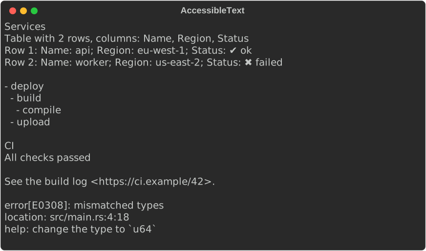
AccessibleText is implemented for core Table, Tree, Panel, Rule and
Text, for markup strings (str), and for
Diagnostic. semantic_text(&renderable, width) handles
any other renderable: it renders plainly and drops the decoration.
Use it when you know the output goes to a screen reader or a log, for
example under the screen-reader policy below. Implement AccessibleText for
your own renderables to give them a reading order.
How structure is recovered
Core Table, Tree, Panel and Rule keep their contents private, as
upstream does. The implementations here recover the structure from a
plain render. Columns come from border junctions, tree depth from the
guides, and titles from the borders. A cell that contains a border
character, a table with show_header(false) and show_lines(true), or a
Table::grid() can be misread.
Policies
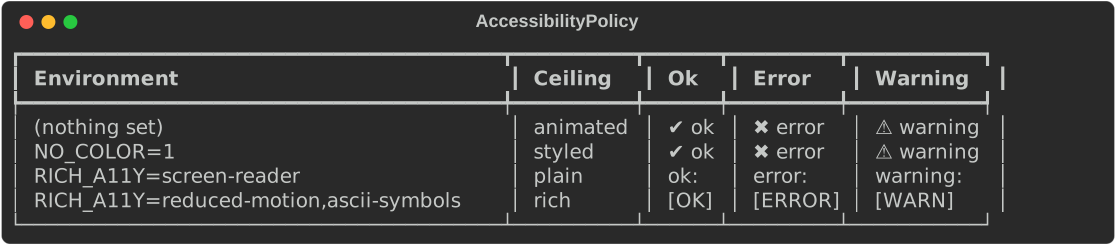
AccessibilityPolicy::from_env(&env) reads the user's preferences:
NO_COLOR(non-empty) turns onmonochrome.RICH_A11Yis a comma-separated list ofscreen-reader,reduced-motion,no-animation,high-contrast,compactandmonochrome, plus a symbol set:ascii-symbolsorword-symbols. Unknown items are ignored and listed inpolicy.warnings.
Pass SystemEnvironment for the real process, or a MapEnvironment in
tests (see Capabilities).
Presets exist for the common cases: screen_reader(), reduced_motion(),
high_contrast() and monochrome().
fn show_policy(console: &Console) {
    let environments = [
        ("(nothing set)", MapEnvironment::new()),
        ("NO_COLOR=1", MapEnvironment::new().var("NO_COLOR", "1")),
        (
            "RICH_A11Y=screen-reader",
            MapEnvironment::new().var("RICH_A11Y", "screen-reader"),
        ),
        (
            "RICH_A11Y=reduced-motion,ascii-symbols",
            MapEnvironment::new().var("RICH_A11Y", "reduced-motion,ascii-symbols"),
        ),
    ];
    let mut table = Table::new();
    for header in ["Environment", "Ceiling", "Ok", "Error", "Warning"] {
        table.add_column(header);
    }
    for (name, env) in environments {
        let policy = AccessibilityPolicy::from_env(&env);
        table.add_row(&[
            name,
            policy.fidelity_ceiling().name(),
            policy.status(Status::Ok),
            policy.status(Status::Error),
            policy.status(Status::Warning),
        ]);
    }
    console.print(&table);

    // Unknown items are kept as warnings rather than failing.
    let policy = AccessibilityPolicy::from_env(&MapEnvironment::new().var("RICH_A11Y", "loud"));
    assert_eq!(policy.warnings, ["ignored RICH_A11Y item \"loud\""]);
}
Applying a policy
| Method | Effect |
|---|---|
theme(&theme) |
High contrast drops dim and turns black, grey and dark blue foregrounds into readable ones. Monochrome removes colours but keeps bold, underline and other attributes. |
console_builder(builder) |
Applies the adjusted theme, sets no colour when monochrome, and turns off emoji and highlighting for screen readers |
fidelity_ceiling() |
The highest fidelity: screen reader → Plain, monochrome → Styled, no animation or reduced motion → Rich, otherwise Animated |
fidelity_policy() |
A fidelity Policy with that ceiling and animation allowed or not |
status(Status::Ok) |
The status marker for this policy's symbol set |
fn build_console() -> Console {
    let policy = AccessibilityPolicy::from_env(&rich_ext::capabilities::SystemEnvironment);
    // A theme without dim/grey (high contrast) or colour (monochrome), and no
    // emoji or highlighting for screen readers.
    let console = policy.console_builder(Console::builder()).build();
    // Cap fidelity-aware renderables (`Degrade`, `Adaptive`) too.
    let _ceiling: Fidelity = policy.fidelity_ceiling();
    let _fidelity_policy = policy.fidelity_policy();
    console
}

fn status_line(policy: &AccessibilityPolicy, ok: bool, message: &str) -> String {
    // Meaning never depends on colour: a symbol and a word, a tag, or a word.
    let status = if ok { Status::Ok } else { Status::Error };
    status.label(policy.status_symbols, message)
}
Status symbols
A status must not depend on colour alone. Every SymbolSet carries the
meaning in text: Unicode pairs a symbol with a word (✔ ok), Ascii uses
a bracketed tag ([OK]), and Words a word only (ok:). Status covers
Ok, Warning, Error, Info, Pending and Skipped, and
Status::label(set, message) prefixes a message:

The lint and capability matrix tools flag output that tells statuses apart only by colour, or uses Unicode symbols on ASCII terminals.
Theme checks
check_theme(&theme, &options) checks every style that sets a colour, dim
or reverse:
- Low contrast: the WCAG contrast ratio against each background in
options.backgrounds(default rich's white export palette and Monokai). Belowmin_ratio(4.5, WCAG AA for normal text) is a warning, and belowerror_ratio(3.0) an error. The finding suggests the nearest colour that passes. - Colour-only distinctions: two styles in a group that become identical
without colour. The default groups are the logging levels,
repr.bool_true/repr.bool_false, anderror/warning/info/success. - Colour-blind confusion: pairs in a group whose colours are closer than
cvd_threshold(CIEDE2000 ΔE 10) under simulated protanopia, deuteranopia or tritanopia (Viénot/Brettel simulation).
Findings are sorted by style name, so a report is stable across runs.
ContrastReport renders them:
fn app_theme() -> Theme {
    Theme::from_styles(
        [
            ("app.title", "bold #1e90ff"),
            ("app.muted", "#9e9e9e"),
            ("app.ok", "#2e8b57"),
            ("app.fail", "#b22222"),
            ("app.link", "underline #6495ed"),
        ],
        false,
    )
    .expect("valid styles")
}

fn show_contrast(console: &Console) {
    let options = CheckOptions {
        // Pairs that must stay distinguishable from each other.
        groups: vec![vec!["app.ok".into(), "app.fail".into()]],
        ..CheckOptions::default()
    };
    let findings = check_theme(&app_theme(), &options);
    for finding in &findings {
        if let FindingKind::LowContrast { ratio, .. } = finding.kind {
            assert!(ratio < options.min_ratio);
        }
    }
    console.print(&ContrastReport::new(&findings));
}
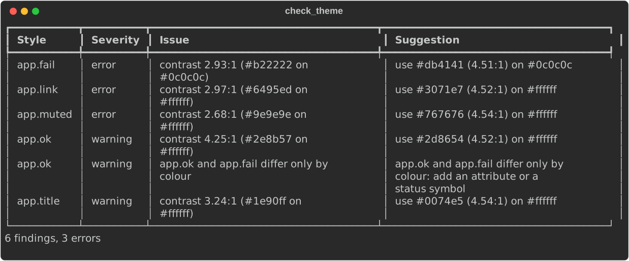
Each Finding has the style name, a FindingKind (with the ratio and
colours, or the pair and deficiency), a Severity and a suggestion.
describe() gives a one-line summary. The colour maths is public in
a11y::contrast: contrast_ratio, relative_luminance, simulate,
delta_e and suggest_color.
JSON for CI
With the serde feature, findings serialize, so a CI job can fail on errors
or post annotations:
fn contrast_json() -> String {
    // Needs the `serde` feature.
    let findings = check_theme(&app_theme(), &CheckOptions::default());
    serde_json::to_string_pretty(&findings).expect("serializable")
}
{
  "style_name": "app.fail",
  "kind": {
    "kind": "low_contrast",
    "ratio": 2.93,
    "fg": "#b22222",
    "bg": "#0c0c0c"
  },
  "severity": "error",
  "suggestion": "use #db4141 (4.51:1) on #0c0c0c"
}
Policies, capability reports and ANSI explanations serialize the same way.
Gotchas
NO_COLORis a preference, not a capability. It changes both the capability report (colour: none) and the policy (monochrome), so check both, as the capabilities page explains.- Semantic text from a render is a best effort for core types; see the
note above. Your own
AccessibleTextimplementations can be exact. - Contrast depends on the background. A style that passes on a dark palette can fail on a light one. Keep both default backgrounds unless you control the terminal.
See also
rich_ext::a11yon docs.rsAccessibilityPolicy,check_theme- Capabilities and fidelity: what the terminal can do
- Quality assurance: lint and the screen-reader profile in the matrix