Overlays and chrome
rs-rich-interact 0.0.2 has overlays that read the keymap: a command
palette, a searchable help overlay, a shortcut sheet, and the Ctrl+K action
menu in a modal. It also has chrome to put round a view: a status bar and
breadcrumbs. Each is a component of its own. Use one alone, put it in a
Layer or a container of yours, or wrap any component in Overlays to get
them all.
A complete example is in the repository:
crates/rich-interact/examples/overlays.rs.
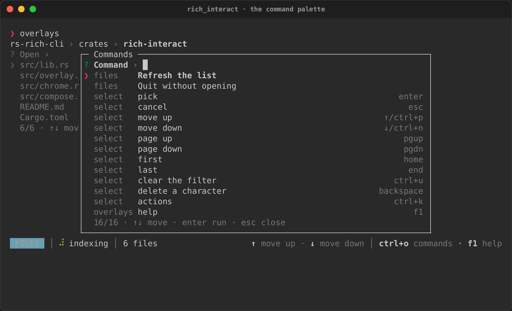
It wraps a Select of files with every overlay, breadcrumbs, a status bar
and actions on the list as a whole. To run it:
Wrapping a component
Overlays::new(component), or component.with_overlays(), wraps any
component. That includes a built-in, a container, or one of your own. The
wrapper adds these keys:
| Key | Opens | Action |
|---|---|---|
| Ctrl+O | the command palette | palette |
| F1 | the help overlay | help |
? or F2 |
the shortcut sheet | shortcuts |
| Ctrl+K | the region's action menu, when it has actions | actions |
Keys reach the component first. An overlay opens only when the component
does not use the key and returns Flow::Ignored. So ? still types into a
select's filter, and F2 opens the sheet there instead. Each overlay reads
the component's keymap (Component::keymap) when it opens, so it lists
what the component can do at that moment. Rebind the keys with
Overlays::rebind, or for the whole process under context overlays:
The overlays are modal layers of a Layers host round the component. A
modal dims what is under it, keeps the keys until it closes, and closes on
Escape. Open layers of your own there with Overlays::layer_handle.
use rich_interact::overlay::{Command, Overlays};
use rich_interact::{Flow, Select};

let app = Overlays::new(Select::new("File", ["a.rs", "b.rs"]))
    .command(Command::new("app.reload", "Reload the list").category("app"), || {
        // Reload here.
        Flow::Continue
    });
The command palette
Palette lists Commands. Each has a label, a category and its shortcut.
Fuzzy search runs over the category and the label, with the same matcher
and FilterState the pickers use. The arrows move, Enter answers the
command focused, and Escape cancels.
- Commands from the keymap.
Palette::from_keymapmakes a command for each binding. Its category is the binding's context, and its label is the binding's description.Command::from_bindingdoes the same for one binding. - Shortcut hints from the keymap.
Palette::hints(&keymap)sets each command's shortcut to the keys that do it now, after any rebinding. - Context filtering.
Palette::contexts([...])lists only the contexts that are active. A command withCommand::context("editor")shows only whileeditoris one of them. A command with no context always shows.
Under Overlays, the palette lists your commands first and then the
component's bindings, in the contexts its keymap has at that moment.
Picking one of your commands runs its handler. Picking a binding sends the
component that binding's first key, as if you had pressed it. Picking
"move down", for example, moves the list down one row.
Help and the shortcut sheet
Help::new(&keymap) lists every binding, grouped by context, with its keys
and description. Typing searches the keys, descriptions and contexts. The
arrows and PageUp and PageDown scroll. The first Escape clears the search,
and the next one closes the overlay.
Shortcuts::new(&keymap) shows every binding's first key and description
in as many columns as fit. Any key closes it. Shortcuts::size gives the
box that fits it.
Both build from any Keymap, so you can use them for a component of your
own without Overlays:
use rich_interact::compose::{ComponentExt, Layer, Layers};
use rich_interact::keymap::keys;
use rich_interact::overlay::Help;
use rich_interact::{Component, Flow, Select};

let select = Select::new("File", ["a.rs", "b.rs"]);
let keymap = select.keymap();
let app = Layers::new(select).open_on("help", keys("f1"), "help", move || {
    Layer::modal(Help::new(&keymap).map(|()| Flow::Continue)).title("Keys").size(60, 16)
});
Actions on a region
The Ctrl+K menu of a Select, and of the table, tree and file views built
on it, now opens in a modal over the list. The modal is titled with the item
it acts on (#474). The keys have not changed: the arrows move, Enter or an
action's own key runs it, and Escape or Ctrl+K closes the menu.
Actions can also target a region, meaning a whole component and not an
item in it. Give Overlays a region and its actions:
use rich_interact::overlay::Overlays;
use rich_interact::{Action, Actions, Flow, Select};

let app = Overlays::new(Select::new("File", ["a.rs", "b.rs"]))
    .region("Files", "file-list")
    .actions(Actions::new().action(Action::menu("refresh", "Refresh the list")))
    .on_action(|action, target| {
        // target.kind is TargetKind::Region; target.value is "file-list".
        Flow::Continue
    });
Ctrl+K reaches the region when the component does not use the key. That
happens when the focused item has no actions, or when there are no items.
The region's actions then open in a Menu, the modal component the action
menu is drawn with. Filters see an ActionTarget with TargetKind::Region,
and plugins see the target kind region. Wrap each pane of a split in its
own Overlays to give each one its own actions.
The status bar
A StatusBar is one line of StatusItems, some on the left and some on
the right:
| Item | Shows |
|---|---|
StatusItem::text(markup) |
console markup |
StatusItem::hints(n) |
the first n key hints from the keymap: ↑ move up · ↓ move down |
StatusItem::spinner(name, markup) |
one of core's spinners, by name, and markup after it |
StatusItem::badge(text, style) |
a short label in a style of its own |
StatusItem::icon(text, markup) |
an icon (one line of text) and markup after it |
StatusItem::micro(asset, markup) |
a micro asset and markup (the micro feature) |
A spinner's frame is picked by time, the way core's Spinner picks it. The
bar ticks while a spinner shows. StatusBar::clock replaces the clock, so a
test can fix the time. Change items while the bar shows through its
StatusHandle: set, put (on a side), remove and set_keymap.
use rich_interact::chrome::{StatusBar, StatusItem};

let bar: StatusBar = StatusBar::new()
    .left("mode", StatusItem::badge("FILES", "bold black on cyan"))
    .left("work", StatusItem::spinner("dots", "indexing"))
    .right("keys", StatusItem::hints(3));
let status = bar.handle();
status.set("work", StatusItem::text("[green]indexed[/]"));
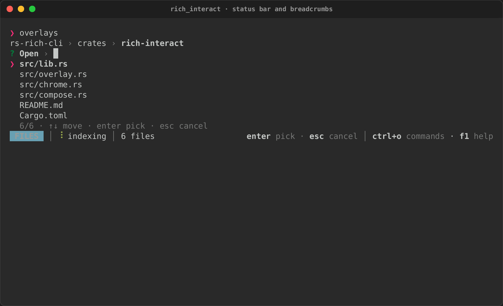
On its own, a status bar is a component that takes no focus, so it goes in
a Column under anything. Its hints read the keymap you give it. Under
Overlays::status_bar, the hints follow whatever has the keys: the
component, or the overlay open over it.
Breadcrumbs
Breadcrumbs::new(["project", "src", "main.rs"]) shows a path, with the
last crumb in bold. When the path does not fit, crumbs drop off the left
behind …. With the mouse on, a click on a crumb cuts the path after that
crumb, or does what on_pick says. crumbs() returns a handle, Crumbs,
that changes the path while it shows (push, pop, truncate and set).
Overlays::breadcrumbs puts them over the component.
Breadcrumbs::icons(|index, crumb| …) puts an icon before a crumb.
Micro assets in the chrome
Everything that shows an icon keeps the icon's style metadata, so a micro
asset's placeholder (rich_micro::placeholder) stays tagged and the
painter's graphics draw the asset over its cells where the terminal can,
and its emoji or text shows everywhere else:
| Where | API |
|---|---|
| a status-bar badge | StatusItem::micro(asset, markup), or StatusItem::icon(&text, markup) |
| a breadcrumb | Breadcrumbs::icons(\|index, crumb\| Some(text)) |
| a list or tree row | Select::set_icons, TreeSelect::set_icons, TableSelect::set_icons |
| an explorer node | DataExplorer::icons(\|path, node\| …) |
| a palette category | Palette::category_icon(category, &text), Overlays::category_icon(category, text) |
| the asset picker | AssetPicker::micro(prompt, ®istry), AssetKind::Micro |
StatusItem::micro, AssetKind::Micro and AssetPicker::micro need the
crate's micro feature (which brings in rs-rich-micro); the icon APIs
take any one-line rich::Text. To draw images rather than fallbacks, give
the event loop a graphics source:
event_loop.graphics(MicroGraphics::detect(registry).source()). The
micro_showcase example does all of this
(cargo run -p rs-rich-interact --features micro --example micro_showcase):
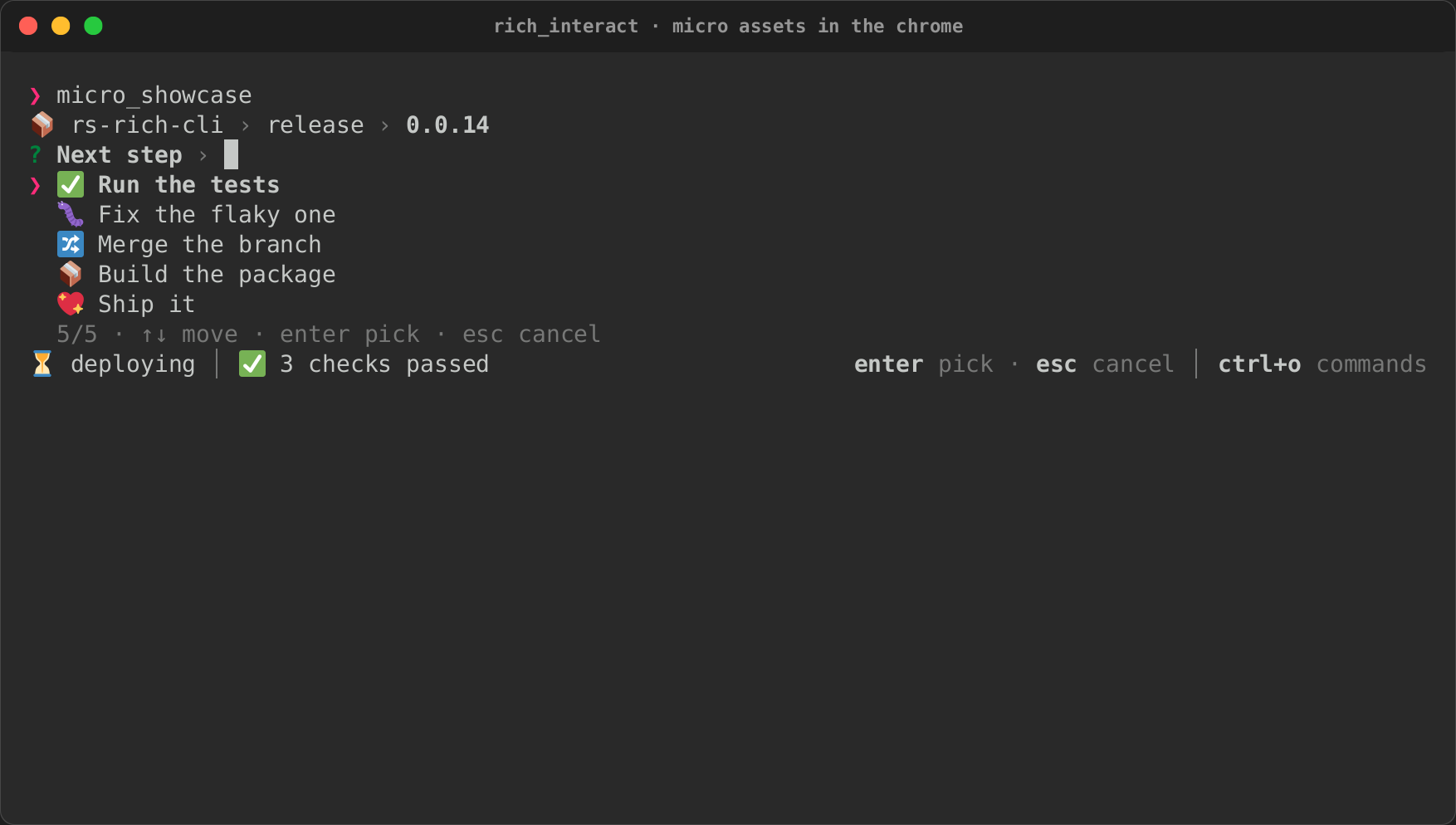
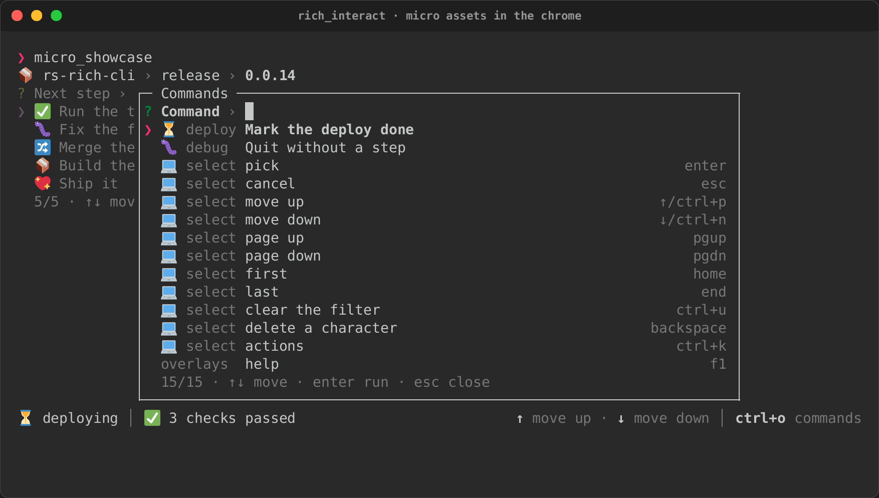
The recording's PTY has no image protocol, so each asset shows its emoji fallback.
Testing
Drive overlays headless like any component. The crate's tests open every overlay over every built-in and over the custom component from Building your own components:
use rich_interact::headless::{self, Script};
use rich_interact::overlay::Overlays;
use rich_interact::{Outcome, Select};

let app = Overlays::new(Select::new("Fruit", ["apple", "banana"]));
let script = Script::new().keys("ctrl+o").text("move down").keys("enter enter");
let (outcome, _) = headless::run(app, script, 60, 16);
assert_eq!(outcome.unwrap(), Outcome::Done("banana"));
Recordings of the palette, the help overlay and the status bar are on the recordings page.