Interactive components (rs-rich-interact)
rs-rich-interact (rich_interact) is the layer between printing and a full
TUI framework: small interactive components that take the terminal, get an
answer, and give the terminal back. rich has no interactive components, so
this crate is an rs-rich addition, not a port.
Components
A component is a state machine. It handles one Event (a key, the mouse, a
resize, a paste, a tick) and returns a Flow:
Continue;Done(value);Cancel;Handoff(command), to lend the terminal to another program.
It renders its state as a View: lines of segments, plus where the caret
goes.
use rich_interact::{Component, Context, Event, Flow, KeyCode, View};

/// Counts Up presses; Enter returns the count, Escape cancels.
struct Counter(u32);

impl Component for Counter {
    type Output = u32;

    fn handle(&mut self, event: &Event, _: &Context<'_>) -> Flow<u32> {
        match event.key().map(|key| key.code) {
            Some(KeyCode::Up) => self.0 += 1,
            Some(KeyCode::Enter) => return Flow::Done(self.0),
            Some(KeyCode::Escape) => return Flow::Cancel,
            _ => {}
        }
        Flow::Continue
    }

    fn render(&self, context: &Context<'_>) -> View {
        View::new(context.markup(&format!("count: [bold]{}[/]", self.0)))
    }
}
Context carries the console to render with and the space available.
context.lines(&renderable) renders any rich renderable (a Table, a
Panel, Markdown) into lines.
A component can also implement start, which runs once before its first
paint and gets the same Context. Use it for work that needs the terminal's
size, such as rendering content at the width. It can also finish the
component straight away, without waiting for a key. The Pager renders its
content there, and a Form with no fields returns from it.
Composing components
Containers are components too: Column, Row and Stack lay children
out, Split puts two side by side with a draggable border, Tabs keeps
each tab's state, and Layers opens modal and popover layers over a base.
Keys go to the focused child and bubble up when it does not use them; Tab
moves focus. The pieces the built-ins are made of are public in kit, and
every key is declared in a rebindable keymap. See
Building your own components.
Ready-made components
Each of these is a Component, so it runs under run, in an event loop and
headless. Each also has a line-based form for when there is no terminal. All
are styled by one Theme. When finished, each collapses to a one-line answer
(? Open › src/main.rs), so a sequence of prompts reads like a transcript.
The screenshots come from the
components tape, which runs
--example components.
Select and MultiSelect
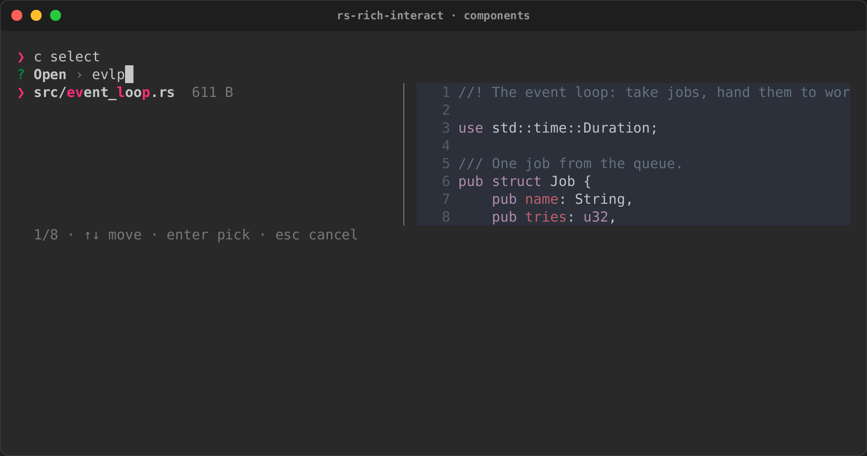
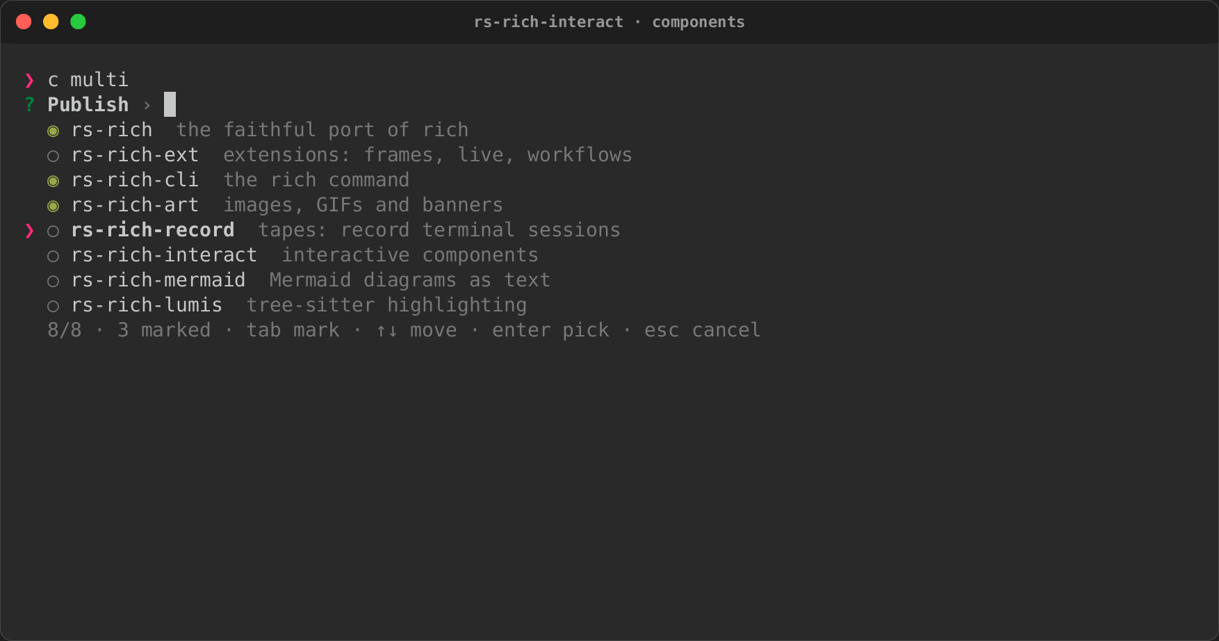
A fuzzy picker over items:
- typing filters, with smart case, and highlights what matched;
- the arrows, PageUp and PageDown move, and Enter picks;
MultiSelectmarks with Tab (Ctrl+A marks every match) and returns what was marked;- an item's actions pick it by their key, and
select.action()says which one was used.
When the focused item has a preview, a pane shows it: beside the list from 72
columns, below it on a narrower terminal. The preview can be text, markup, or
any renderable, such as a Syntax.
use rich_interact::{run, Item, Preview, RunOptions, Select};

let items = paths.into_iter().map(|path| {
    let preview = Preview::Renderable(Arc::new(Syntax::new(read(&path), "rust")));
    Item::new(path.clone(), path.display().to_string()).preview(preview)
});
let picked = run(Select::new("Open", items), &RunOptions::default())?;
Input
One line, which edits like a shell's: the arrows, Home and End, Ctrl+A, Ctrl+E, Ctrl+U and Ctrl+W.
- Placeholder, default and masking. A placeholder shows while the line is
empty;
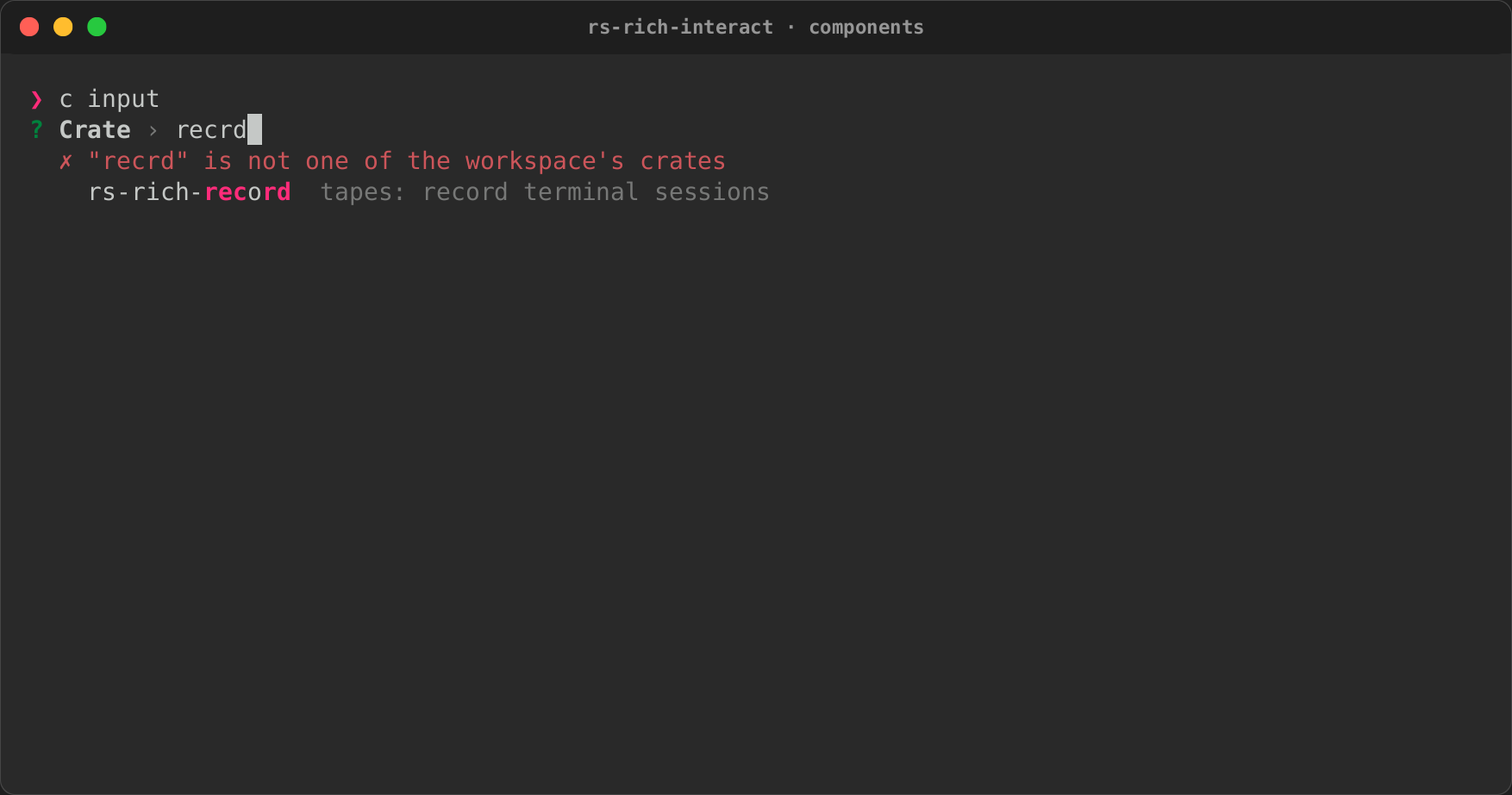
defaultanswers an empty line;Input::maskedhides what is typed, for passwords and tokens, and shows a default only as(default set). Without a terminal session but with stdin a terminal (token=$(app)), it reads its line with echo off, as Python'sgetpassdoes. - Validation. A validator's message shows under the line, and Enter waits until it passes.
- History. Up and Down walk earlier answers.
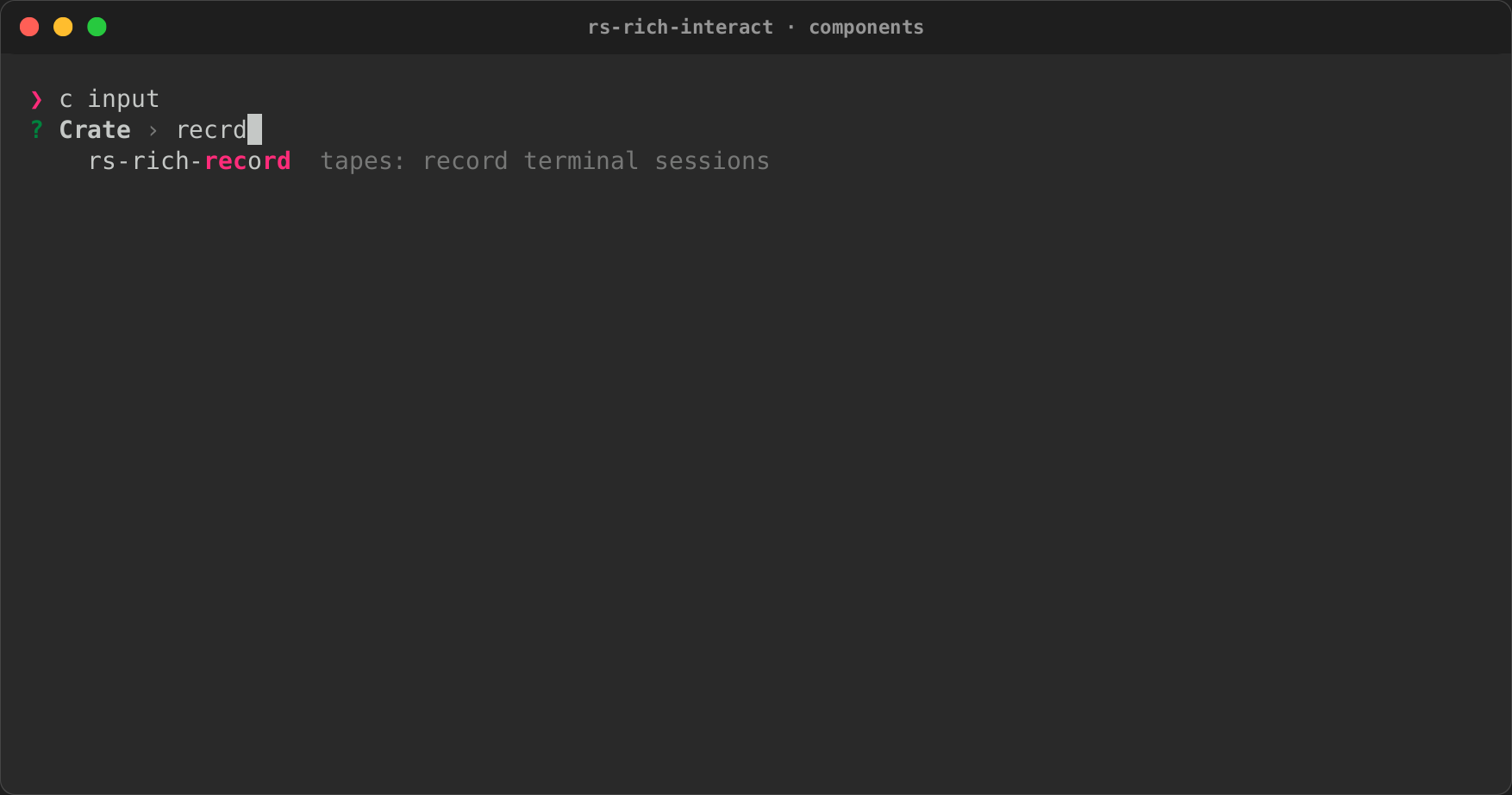
- Suggestions. They come from a fixed list, filtered as you type, or from a
providerthat runs on a background thread, so a slow lookup (a registry, a file system) never stalls typing. The input keeps one such thread. It runs one lookup at a time and, when free, takes only the latest text, so fast typing never piles up lookups. Tab accepts one. Suggestions work the same inside aFormfield.
let input = Input::new("Crate")
    .suggestions(["serde", "serde_json", "tokio"])
    .validate(|text| if text.is_empty() { Err("required".into()) } else { Ok(()) });
Confirm
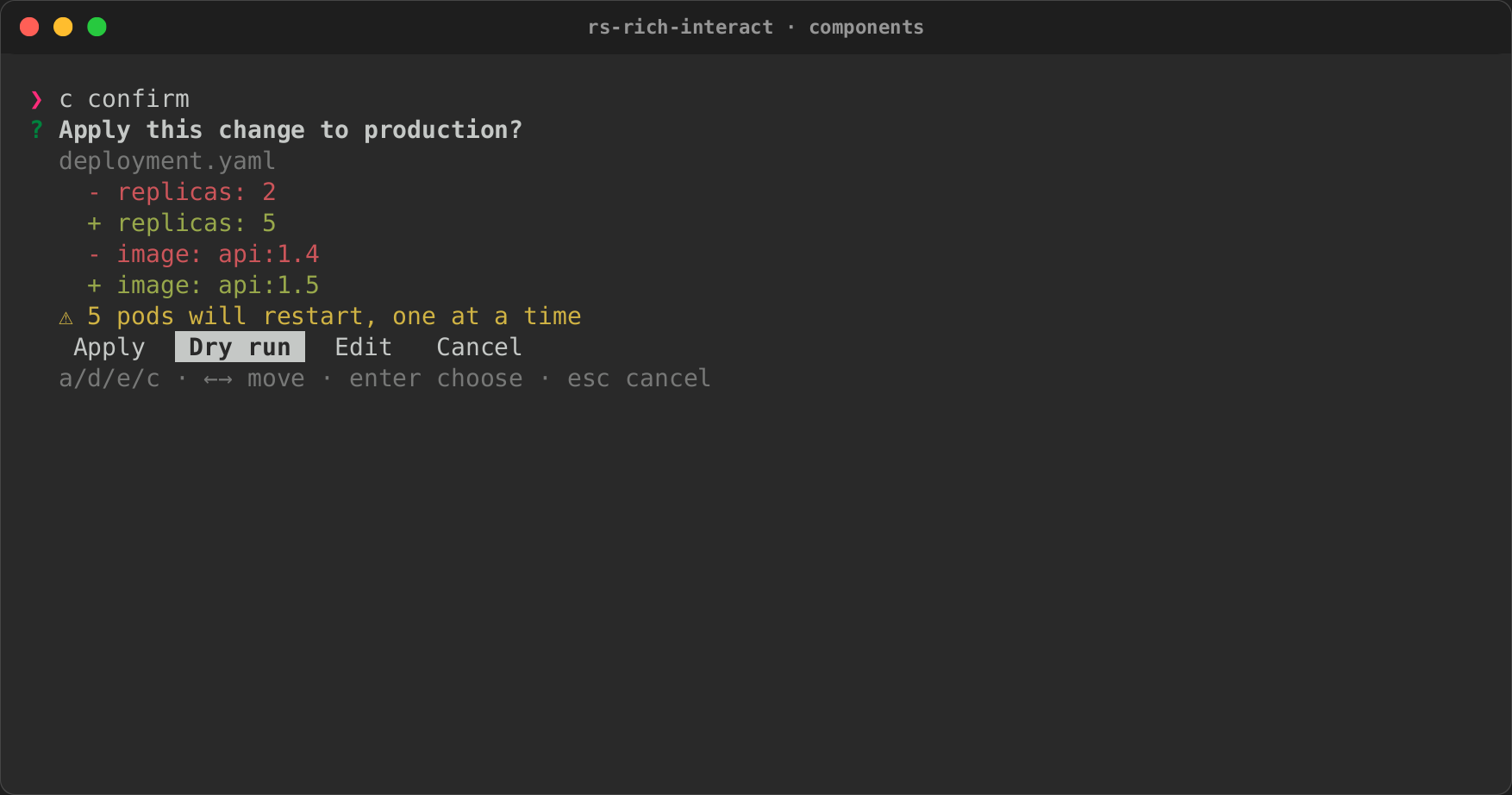
A confirmation sheet: what will happen, then a choice.
- Body: any renderables (a diff, a table of affected files), in a scrollable viewport.
- Warnings: listed under the body.
- Choices: as many as needed, each with a key:
Apply,Dry run,Edit,Cancel.Confirm::newalone is yes or no.
let sheet = Confirm::new("Apply this change to production?")
    .body(diff)
    .warning("5 pods will restart, one at a time")
    .choices([
        Choice::new("apply", "Apply", 'a'),
        Choice::new("dry-run", "Dry run", 'd'),
    ])
    .default("dry-run");
Form
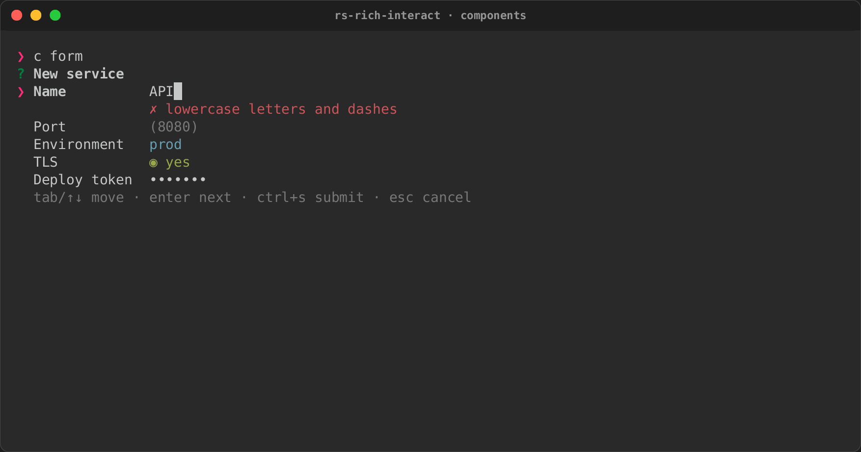
Several fields answered together.
- Field kinds: text (any configured
Input), masked text for passwords (Form::masked), a choice among options, and yes/no toggles. - Moving: Tab and the arrows move between fields; Enter moves on and, on the last field, submits.
- Errors: submitting checks every field, puts each failure's message under its field, and focuses the first one.
The result, Answers, gives each value by field name.
let form = Form::new("New service")
    .input("name", Input::new("Name").validate(lowercase))
    .input("port", Input::new("Port").default("8080"))
    .choice("env", "Environment", ["dev", "staging", "prod"])
    .toggle("tls", "TLS", true);
let answers = run(form, &options)?.value();
Pager
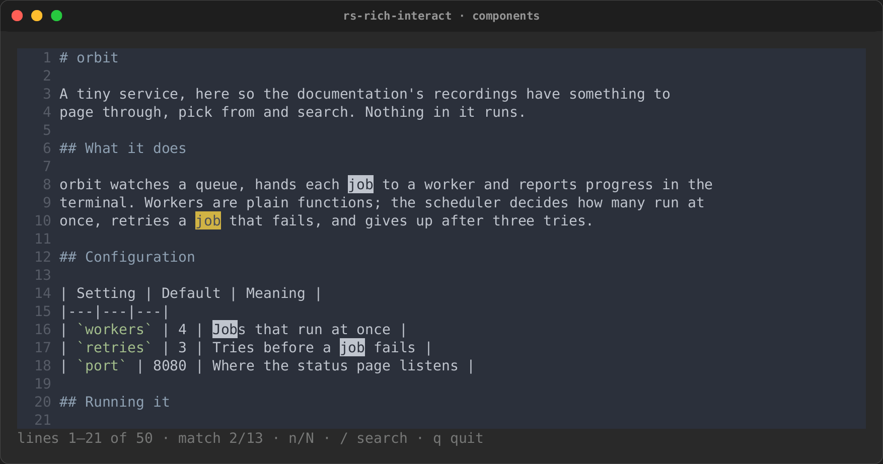
Pages any renderable at the terminal's width, and renders it again after a resize.
- Moving: it scrolls like the viewport;
qor Escape closes it. - Searching:
/starts a search. Matches are marked in place, the current one in yellow, andnandNjump between them. - Without a terminal: it writes the content out in full.
TextArea
Several lines of text, for rich write.
- Editing: Enter starts a line; the arrows, Home/End, Ctrl+A/E, Ctrl+U/K/W, Backspace and Delete edit, the caret moving by grapheme cluster. Long lines wrap one cell short of the edge, and the text scrolls to keep the caret in view.
- Finishing: Ctrl+D submits (
submit_keychooses another key); Escape cancels. - Limits:
char_limitcounts line breaks too, and cuts pasted text. A paste keeps its line breaks; other terminal controls are dropped. - Without a terminal: every line of input up to its end is the text.
FilePicker
Browses from a root, for rich file. The listing is a Select, so typing
filters it, and the focused entry is previewed beside it: a text file's
first 200 lines, highlighted by extension; a directory's entries; or why
there is nothing to show (a binary file, a FIFO, which is never opened).
- Moving: Enter opens a directory or picks a file, Right opens, Left
and Backspace (with nothing typed) go up to
.., Ctrl+T shows hidden files. A directory opens with its first entry focused. - What may be picked:
FileMode::File(the default),Directory(files are not listed) orBoth;extensionskeeps only some files. - A root jail: with
jail(true), nothing outside the root is listed, opened or read:..stops at the root and a symbolic link out of it is left out. - Names that are not UTF-8 show with each such byte as
\xNN, as therichcommand spells such paths; the path returned is the real one. - Without a terminal: the
defaultpath, or no answer.
ColorPicker
A colour, for rich color: rich's named colours, filtered as you type; a
colour typed as #rrggbb, rgb(r,g,b) or color(N), offered first; or
the 256-colour palette, a 16 by 16 grid on Tab. A swatch shows the focused
colour with its hex, RGB and names. The answer is a colour string rich
parses, as ColorFormat::Hex, Name or Rgb says.
AssetPicker
An emoji, a box style or a spinner, for rich asset, with a preview (the
emoji, a small table drawn in the style, the spinner's frames). The lists
come from core's public API: the emoji names are those of core's table,
each resolved through rich::emoji::replace. With the micro feature,
AssetKind::Micro (or AssetPicker::micro(prompt, ®istry)) lists micro
assets, each drawn in its row and magnified in the preview, and answers
with the asset's name. Run it with
run_with_graphics(picker, &options, graphics.source()) (a
rich_micro::MicroGraphics) to draw the rows' assets as images where the
terminal can; run shows their emoji.
TableSelect and TreeSelect
Pick a table's row (columns aligned under their headings, filtered by any
cell) or a tree's node (guides drawn, Left and Right fold and unfold,
searching finds nodes inside folded ones). Both are a Select underneath.
A table copies its row or a cell as text, CSV or JSON, and a tree keeps each
match's ancestors, shows breadcrumbs and copies a node's path: see
Explorers, copying and live lists.
DataExplorer and ThemePicker
DataExplorer (the data feature) explores a JSON, YAML, TOML, XML, INI
or dotenv document as a tree, with breadcrumbs, search and copy, and is what
rich explore runs. ThemePicker previews a sample in each theme as you
move. Both are in Explorers, copying and live lists.
Mouse
Mouse reporting is off unless a component asks for it
(Component::mouse, set by each component's with_mouse(true)), since it
takes text selection away from the terminal. run then turns it on for the
session; a component painting inline on standard error is moved to the
alternate screen, where clicks can be placed.
- Coordinates: the event loop gives each component mouse events in its own view's rows and columns, wherever the view is on screen; a press outside the view is not delivered.
- Links: a left click on a hyperlink (an OSC 8 region: a style with a
link) arrives as
Event::Link(url). Opening it is the caller's choice: the pager records it (Pager::links) and shows it in its status line. - Rows and buttons: in
Selecta click focuses a row and a second click picks it;Confirm's choices are buttons, andFormshows Submit and Cancel buttons and focuses (or flips) the field clicked. - Pane resizing: the border between a list and the preview beside it drags, each pane keeping at least 12 columns.
- Tests:
Script::click,drag,scrollandmousescript it.
Actions
An Action has an id, a label and an optional key. An item's own actions,
and the view's Actions (offered on every target, or on those a filter
accepts), apply to list items, table rows, tree nodes and file entries
alike: the filter sees an ActionTarget with its TargetKind (item,
row, node or file), label and value. An action's key picks the item
directly; Ctrl+K opens a modal menu of every action for the focused item.
The component finishes with the item, and action() says which action.
Actions can also target a whole region (TargetKind::Region), through
Overlays: see Overlays and chrome.
use rich_interact::{Action, Actions, FilePicker, Key, TargetKind};

let actions = Actions::new()
    .action_for(TargetKind::File, Action::new("edit", "Open in $EDITOR", Key::ctrl('e')))
    .action_if(Action::menu("run", "Run it"), |target| target.value.ends_with(".sh"));
let picker = FilePicker::new("File", ".").actions(actions);
Plugins add actions through rs-rich-plugin-api: a CustomAction (a
label, an optional key name, the targets it applies to, and an optional
run) registered with PluginRegistrar::action.
Actions::from_registry(®istry) offers what the plugins of an
ExtensionRegistry registered; rich file offers them, and prints what a
plugin's run returns.
Running one
run is the blocking driver:
- It starts a terminal session.
- It drives the component to an
Outcome:Done(value),Cancelled, orInterruptedon Ctrl+C. - It restores the terminal.
use rich_interact::{run, Outcome, RunOptions};

match run(Counter(0), &RunOptions::default())? {
    Outcome::Done(count) => println!("counted {count}"),
    Outcome::Cancelled | Outcome::Interrupted => {}
}
By default the component paints inline, below the cursor, and its last view stays on screen. The options can change that:
SessionOptions { alternate_screen: true, .. }takes over the whole screen and restores it afterwards;output: Output::Stderrpaints on standard error, which leaves standard output to the answer a script captures (choice=$(app));mouse: truereports clicks and the wheel;bracketed_paste: truedelivers a paste as one event;LoopOptions { transient: true, .. }clears the region at the end;heightlimits how many rows the inline region may take.
Several at once: the event loop
EventLoop runs several mounted components together:
- it stacks their views;
- it sends keys to the first one still running;
- it delivers each component's ticks (
Component::tick) and the loop's timers (EventLoop::every).
It repaints only what changed. The painter writes the cells that
Frame::diff reports, so an idle loop writes nothing at all. run is this
loop with one component.
The loop is deliberately small (events, timers, repaint on change), so that the intuiTUIve track can build its component tree, reactive state and focus routing on top of it.
The terminal is always given back
A session turns on raw mode and, optionally, the alternate screen, mouse reporting and bracketed paste. It undoes all of them on every way out:
- when the component finishes;
- on an early return or
?, when the session is dropped; - on Ctrl+C, which ends the loop as
Interrupted; - on a panic, through a hook that restores the terminal before the panic message prints;
- on Unix, on SIGTERM, SIGHUP and SIGQUIT, through a thread that restores the terminal and then takes the signal's default action, so the process still ends as the signal asks. The handlers are installed with the first session and stay, because removing them would leave the signals ignored;
- on Unix, for a suspend: Ctrl+Z (a key in raw mode) or a SIGTSTP from
outside gives the terminal back, stops the process as the shell expects,
and on
fgturns the modes back on and repaints the whole view. An inline region starts again below the shell's "Stopped" line.SIGSTOPcannot be caught, so it stops with the modes still on. ABackendthat cannot suspend (the headless driver, by default) passes Ctrl+Z to the component as a key.
Whatever a view holds, terminal controls in its text (an escape from a
file, a pasted ESC c, an 8-bit CSI) are painted as visible characters
(␛c, �), one for one; styles reach the terminal only as styles. Pasted
text loses its controls before it reaches an Input or a picker's query.
A component can lend the terminal to another program by returning
Flow::Handoff(command). The session is left, the command runs with the
terminal as it was, and the session comes back. The component then receives
Event::Returned(exit_code). That is how "open in $EDITOR" works.
Only one session runs at a time, because the terminal's modes belong to the
whole process. A component that calls run from inside another gets an
io::ErrorKind::ResourceBusy error, and the outer session carries on
unchanged. Mount both components on one EventLoop instead.
PTY tests check each of these by running stty -a in the same terminal
afterwards.
No terminal, no blocking
A component needs a terminal on both ends. run degrades instead of starting
a session when any of these holds:
- stdin or stdout is redirected;
CIis set;TERM=dumb;- the caller turned interactive mode off.
What happens then is the Policy fallback:
| Fallback | Then |
|---|---|
Prompt (default) |
Component::prompt asks line by line: prompts on stderr, answers from stdin. A component without a line form returns its default |
Default |
Component::default_value |
Error |
Error::NotInteractive with the reason |
Nothing emits control sequences or waits on a pipe.
When input ends before an answer, the built-in components answer with their
default (an Input or Confirm default, a Select default, the marked
items of a MultiSelect), as they do for an empty line. Without one, run
fails with NotInteractive::NoDefault: end of input is no answer, not a
cancel. Component::prompt returns Ok(None) only when the user backed out,
Err(NotInteractive::Ended) when input ran out, and a masked line read with
echo off returns Err(NotInteractive::Interrupted) on Ctrl+C, which run
reports as Outcome::Interrupted.
A picker that reads its list from a pipe (ls | app) can still take keys
from the keyboard: Policy { tty_keys: true, .. } reads them from the
controlling terminal when standard input is not one. rich choose,
rich filter, rich input, rich confirm, rich pager, rich write,
rich file, rich color and rich asset run this way,
painting on standard error (the CLI guide).
Viewport
Viewport is a scrollable window over rendered lines. It moves with:
- the arrow keys and
j/k, by a line; - PageUp/PageDown and Space, by a page;
- Home/End and
g/G, to the ends; - the mouse wheel.
A component keeps one and renders its visible lines. Because repaints are cell diffs, scrolling rewrites only what moved. On its own it is a minimal pager:
Items
Item<T> is the one model behind every picker: file pickers, command
palettes and history search alike. It holds:
- a value;
- a label;
- a description;
key: valuemetadata;- a preview (text, markup or any renderable);
- actions bound to keys;
- extra search keywords.
Item::search_text() is what a filter matches against.
use rich_interact::{Action, Item, Key, Preview};

let item = Item::new(path, "main.rs")
    .description("the entry point")
    .meta("size", "2 KB")
    .preview(Preview::Text(source))
    .action(Action::new("edit", "Open in $EDITOR", Key::ctrl('e')));
Testing components
The headless driver runs the same event loop with:
- scripted events;
- a virtual clock, so a
waitmakes ticks and timers fire without sleeping; - a recorder that keeps every paint, both as the exact bytes and as plain text.